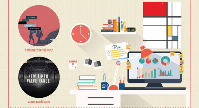
Web design is a very rapidly changing and trends come and go very quickly. We are still working with some of these trends today, flat design, performance and speed, improving user experience and so… However, what are the web design trends we can expect in 2016?
More experimentation with menus
More and more web designs resulting with the so-called “hidden menu”, more often you will encounter a website where menus will not be visible immediately on top of the web page. The newest trend in web design are menus that open by pressing the menu button on the left or the right or by clicking on the one of the elements on website.
Scrolling or not
There are advantages and disadvantages of both. A scrolling, maybe seems more natural, but what if the visitor miss important content? Predictions says that more and more websites will start using less scrolling and all you need to see and know will be evident immediately and without the need for scrolling down.
Flat design domination continues in 2016
Flat design will continue to dominate during 2016. TThe best example is that Google dared to make redesign of their logo and make it as flat as possible and readable.
Fullscreen forms
More and more you will encounter the full screen login or contact form. Instead of looking for it in the page corner where you can log on and send the request, from now on you will come across the buttons for the contact to push open a new window to login or contact form.
For more web design trends for 2016, check out the infographic below:


