Knowing the way of creating an engaging site takes more than just a talent for visuals. Beautiful artwork, engaging colors, and tasteful fonts are only a part of the equation. When it comes to creating websites, knowing what looks good can only get you so far.
The reason why the aesthetic approach is insufficient is simply due to the development of the Internet and web design in general. Nowadays, businesses are investing a lot of their time and money to have a better understanding of what the consumers want to see. Psychology has learned about specific patterns humans take when seeking new information. Combining this with over 20 years of analyzing how people perceive online browsing – a pretty clear picture is formed on the usefulness of combining web design and psychology.
Using some of the already known tricks is common, while some really useful ones are neglected and put aside, 2025 will be the year where your design can flop on the most unsuspecting of details. This is why I will lay down below aspects that can push your website design to the top level.
Subtle animations
While this may seem like something one would say regardless of what year it is, animations hold a very important place in web design, according to ctrlaltcreate.co. They give life to the web page, while also emphasizing important parts your users may explore. If mouse-overs, clicks, scrolls or other commands influence the animation – a sense of playfulness and vividness is achieved.
During the 00’s it was quite common to see aggressive animations and pop-ups across the board. Websites demanded attention, and they weren’t shy about it. Rarely is there a fun memory of old web design, mostly due to the obnoxious way animations would pop into your sight. They were aggressive in color, movement, and transition.
Planning animations in 2018. has to be done with discrete taste. Animations have to precisely complement the design both in movement and design. Using smooth transitions, parallax and emphasizing information will have to be surgically precise. Our brains are wired in such a way that excessive movement is easily noticeable on a static screen.
Custom art/illustrations
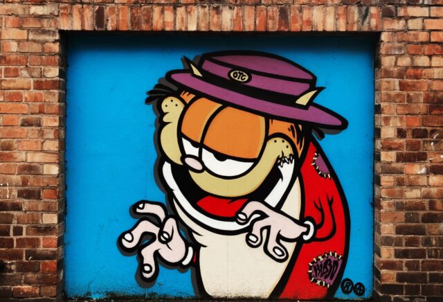
Is there a better way to attract interest than with engaging art? We understand the text as a clear medium of correspondence (much like reading this article). Visual art is, however, easier to digest, sends a clear message and inspires playfulness and fun. While filling up blank space on your web presentation, custom made art can reinforce the awareness and message a brand is trying to convey. Additionally, if your illustrator hits the nail on the head, the art will make the brand stand out and be unique in today’s very saturated online market.
What is great about using custom art is the fact that you can dictate the tone your website wants to send. For businesses that operate in serious spheres (such as banking for example), illustrations are a great tool to segue the seriousness and usher in a playful mood. Becoming unique is a great challenge for any online presentation – ignoring that possibility is ill-advised.
Prioritizing mobile platforms
My introduction mentioned that mobile browsing has surpassed its desktop counterpart in 2017. Searching for items to shop is a pastime most do while doing menial daily activities or just simply waiting for something. This created a race for the most optimal solution to the UI/UX problems caused by the smaller size of the screen.
After countless trials and errors, we can safely say that mobile web design has grown and some common traits of quality design can be specified. Clunky menus with big buttons have been replaced with the roll-out burger menu. Even though it is safe to say that the burger menu is widely overused, to this day it remains the most space efficient solution for smaller screens. Large-scale photos are best to be avoided as they eat up a lot of the space and megabytes users use to access the mobile Internet. Ditch these in favor of a clean design with common icons that are widely recognizable by most users due to their frequent use. Testing is hugely important, so make sure to use any user feedback you can to improve the initial design. Iteration is the key to achieving the superb mobile design.
Gradients making a comeback

Flat design flooded the web industry with its simple and easy to understand design and text dynamic. Depth was only added for the purposes of functionality (Apple was notorious this). This led to an almost silent death of gradients in the design world, the flat design was far easier to implement and the design cost was significantly lower.
Only emphasizing depth is a thing of the past for gradients today. They are huge, colorful and very visible. The most creative way of using them is to apply a gradient filter over images. This transforms their look, creating an interesting way to influence the visuals. Using gradients in backgrounds instead of flashy images is also a great way to compromise on the lack of photography. The use of gradients can be quite creative if you have art taste or a competent designer. I suggest utilizing them or even consulting web development experts to do the thinking for you. Visit here for the list of professional design agencies.
2018 will be the year where the pieces definitely have to be cohesive and fit together when it comes to assembling a web page. This is done by utilizing the tendencies of the mind with approachable color schemes and playful characters/art. Being unique is what it’s all about, even though you should definitely start with some proof of concept.
Find what others have done and had success with, tweak it according to the way you want to stand out and you should be good to go. The most difficult part is not overdoing the flashiness of the eye candy and keeping everything in good taste. With careful treads and constant testing, such result is easily achieved.


