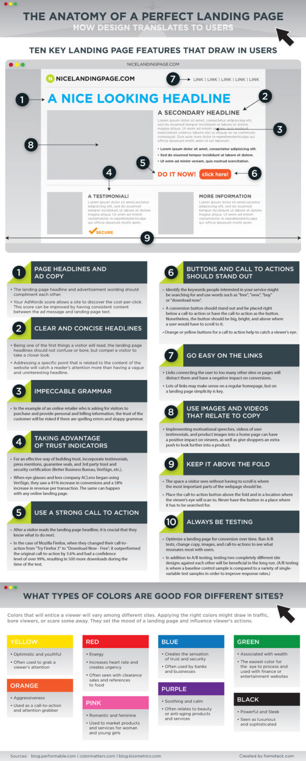
Landing page is a page on which visitors “lands” and that should take some action, such as, send a request, subscribe to a newsletter, buy a product or request additional information. This is why this site should be designed rigt in order to encourage action. Content should be promotionally oriented but concise, with a focus on a single message. Instead of a long text, message should be highlighted with “strong” graphics and shorter text. The customer should be deployed by simple navigation to the desired directional action.
Direct title with a clear statement of what is to be achieved will encourage visitors to see what value has your a service or products. A high converting landing page is extremely important as it enables you, as the webmaster, to get the most out of all the users arriving at your website.
Below are some tried and tested design improvements that will help your website convert better. These four changes are one-off, extremely quick and easy to implement and will require zero or minimal input from a developer. With the time taken to execute and the long term benefits they will reap, it makes these small changes a no-brainer. So, if you want to learn how the perfect landing page should look, check out this infographic:


