Do you know what a landing page is? And how important it can be for your business? If you don’t know then it is time for you to learn it because if you make a good and optimized landing page your business could improve significantly.
To learn how to make an optimized landing page you must first realize exactly what it is and what the benefits of it are.
Landing page can be defined as a page on website that allows visitors to enter some of their information into form included on that page. Landing pages are a great solution for some campaigns for collecting subscribers and similar stuff. They are also a fantastic way to convert a simple traffic to leads and money. Most of companies send their traffic from social media networks, emails or advertisements directly to homepage but that is a mistake. With an optimized targeted landing page you will be able to increase effectiveness of your marketing.
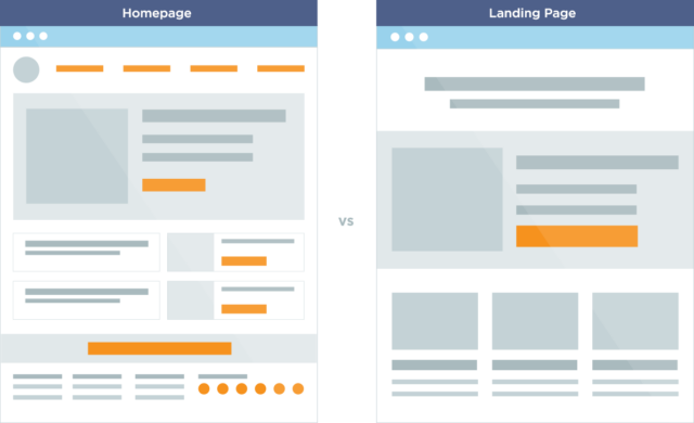
Homepage vs landing page
Lots of people don’t know the difference between these two pages. I already mentioned some main differences above but let’s explain both of them. A homepage can be defined as the main entrance to some website. Main goal of homepage is to guide visitors to the rest of your site. And when someone gets to your homepage they probably know what that page and business is all about. Homepage includes navigation to other pages of a website like blog, product, service, contact, some articles and similar. On the other side we have landing page and main goal of landing page is not to guide visitors to somewhere else but to make them do something, make some action and accomplish a goal. When someone gets to a landing page they often don’t know what that business and website is about. They don’t trust you and landing page is the way to build their trust.
Benefits of landing page
Now that you know something about landing pages and what they are you should know why everyone should create their own landing page. You could figure that out from the first paragraph but here are some other reasons too.
- Leads
Lead generation page is a page that allows owners to collect some information from visitors. That information can be their names, email, address or any other information that is useful to owner. A good example of lead generation page is page that offers some free e-book, subscription to newsletter, some guides and similar stuff.
- Sales
Landing pages are widely used for direct sales. An example of landing page for sales is a product page, page that offers some free trial and similar things that offer product or service. And like you can guess the main goal of this page is to sell something.
- Relationship
Landing pages that offer relationship building are often called click-through pages. The main goal of these pages is to guide visitors through some path and “force” them to keep clicking and going forward. Imagine that you come to some landing page and see that it is selling something. Will you immediately buy it? Probably not. Even if you came to that page just for that particular product you won’t buy it immediately without learning something about it first. That’s why click-through pages are used, to drive visitors forward, show them more details and get them familiar with product before you redirect them to the main landing page for sale.
Good landing pages
It can be really hard to design and make a good landing page what will get visitors attention when they visit it. You only have few seconds to impress a visitors and present your product or service. Here are some websites that have done it perfectly.
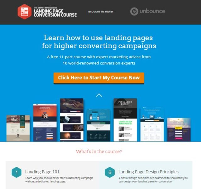
Our first pick is a website called Unbounce. Since they wrote a book on how to create landing pages it is no wonder that their landing page is perfect. When you enter the page first thing you notice is their offer for free course. Design is very attractive, all elements are perfectly visible and you even have FAQ for the course below.
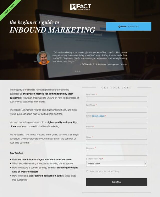
Another great example of good landing page is IMPACT. Layout of the whole page is very good, design is very attractive and that “Free download” button is very appealing. And if you want to get your copy of their guide you can enter your information into form below.
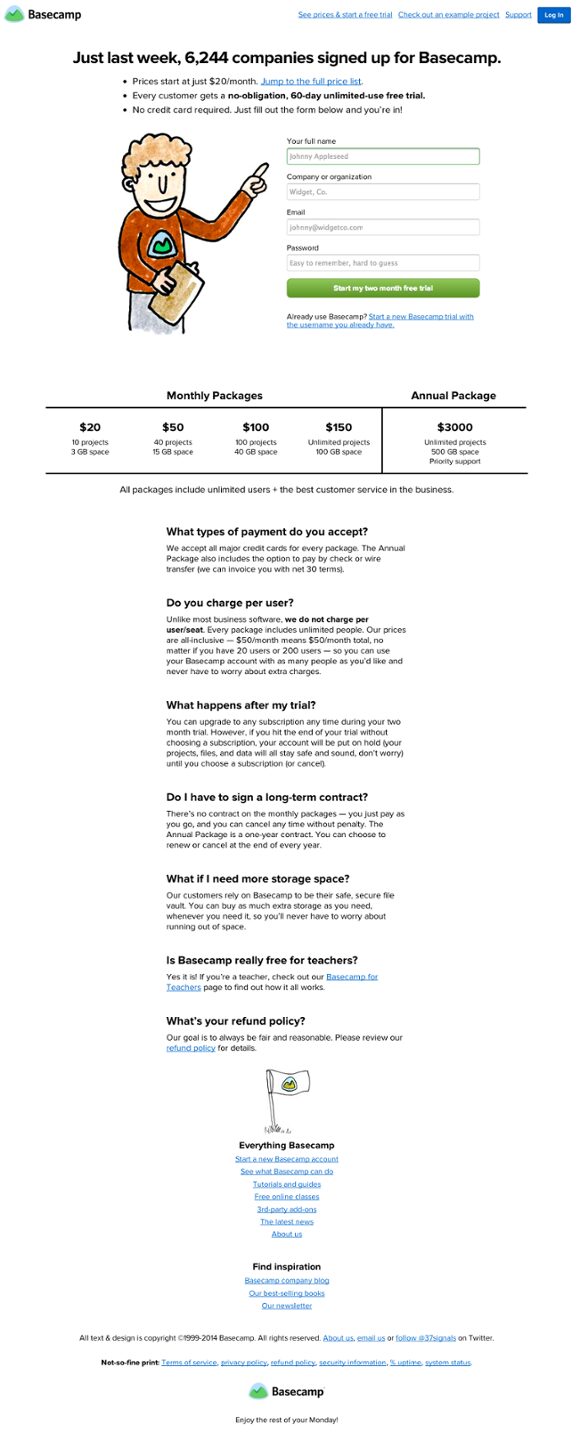
Another website that has a great knowledge of landing pages is Basecamp. When you go on the page the first thing you notice is that funny looking cartoon guy that points you to offer for a free trial. On the top of the page you have some information of how many companies signed up there, what is the price and similar stuff and below that funny guy there is information about different packages and FAQ.
- Bills.com
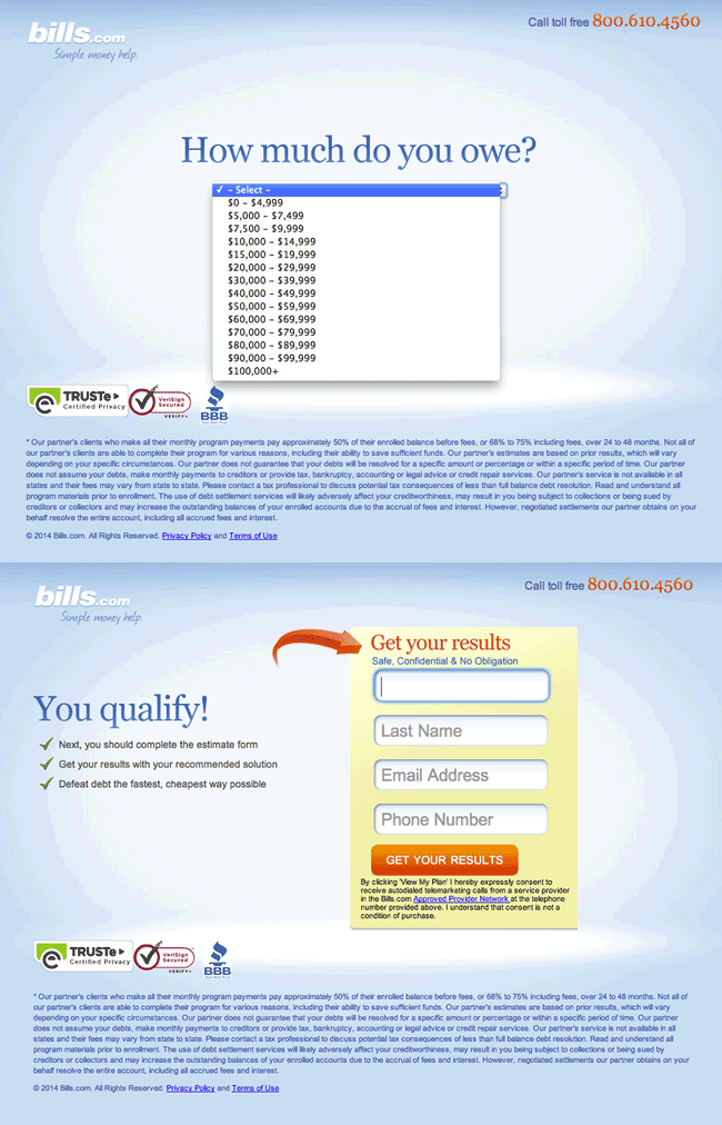
This website is a perfect example of a non-static landing page. If you have the needed knowledge and idea then you can make your landing page interactive. On Bills.com landing page you have to answer two questions first and then the form will show up. Nice one!
The last page on our list is landing page from Webprofits. At the top of the page you have the option to enter your email address and when you do the rest of form will appear. Form is kind of long so with this little trick they made the long website shorter. Oh yeah, if you want to find out the whole story about this website and what it does just scroll below the form because all the information is there.
3 steps to perfectly optimized landing page
And now to the main part. So far you learned what landing page is and why you need it. It is time to learn how to optimize it. There are three key steps that will lead to perfectly optimized landing page and they are explained below.
- Blueprint
Before you start with anything you must define your goal. You can’t create landing page if you don’t know what it will do. Do you want to sell product? Increase downloads of your e-book or some paper? Want more subscribers? Decide what you want with it and always promote only one offer on landing page.
After you decide what is the goal of landing page you must realize that landing page is not about you, it is about customers. Write the main problem in the tittle and offer solution in landing page.
When you make that and create some first few parts of a landing page make sure to direct all your traffic to a landing page and not to homepage. I already explained why when I pointed out the difference between homepage and landing page.
- Optimizing elements
After you have done all that basic stuff I mentioned above it is time to start optimizing. Optimization can be defined as some process where you want to increase conversions while investing minimum amount of money.
The first step is to include USP in the headline. USP (Unique Selling Proposition) is some slogan or a simple word in your headline that will make some impact on anyone who reads it.
You already know that every landing page must lead to some goal and that goal are conversions. Don’t just talk about features that your product is offering, talk about benefits and solution to problems.
When you include USP to attract visitors and get their attention with effective presentation of benefits it is time to create CTA button. If must be attractive and noticeable.
Images and videos can be an important part of your landing page. Remember that funny cartoon guy we saw on Basecamp landing page I presented above? It is funny and when visitors find something funny on your site their mood will improve and they will love you more.
Forms are also one of the most important parts of landing page but you need to keep them short. And don’t ever ask for unnecessary or weird information. For example, you don’t need someone’s address or phone number if you are offering a download of free e-book.
Testimonials are a way to make your visitors trust you. With testimonials you must show your potential customers that your existing customers are happy with your service or product.
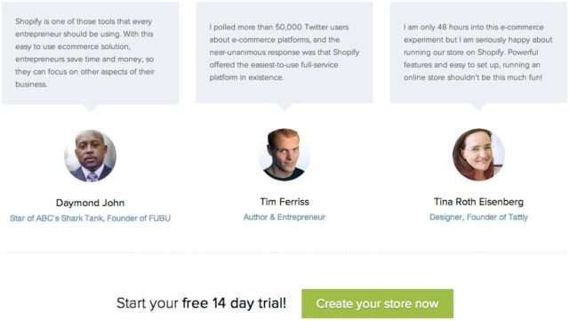
If you have some companies that are investing into your product or service always point that out.
To increase trust with potential customers try to include a link to your privacy policy, enter your phone number or place some reviews from different websites (if there are some).
After you do that make sure to remove navigation. You don’t want to offer your potential customers a way to leave website. The only clickable link on your page must be CTA button.
- Testing
It may sound weird but testing is one of the most important parts of creating a perfectly optimized landing page. And I’m not talking about the first test before publishing. Landing pages must be constantly updated and tested. Test it yourself and ask your friends or some professionals to check it and say if there is anything wrong. A good way to test landing page is A/B testing where you compare two different versions of your landing page.
And finally the end. I hope you learned something about landing pages and I hope that you now know how to optimize your landing page to get more conversions and accomplish your goals. Good luck!
