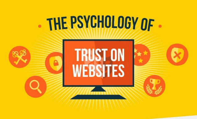

How trusted is your website? 1 of 4 people just don’t have trust in online organization, when it comes to their personal details and almost 50% of users are being worried about security when buying something online. If you want to have any success online it’s important to “install” trust in your visitors. They want to be sure they are not scammed by someone and that their personal details are going to be secure. So what makes people trust your website and trust you? Why you trust some website you visit? People usually don’t have confidence in websites because of too much advertising or ads in general with no unique or little content, too much design, no clear purpose of site, text hard to read, and so on. People can know when they are getting fooled. When visitors comes to your page for first time, you don’t have more then a split of a second to make nice impression on that person before he slams that back button. You need to convince visitors you are trustworthy source.
Building trust on website
Internet has come a long way and it’s no more observed as being a black hole. People can now make quick decision if that website that they landed on is trustworthy and legit. Having human factor on webpage is really essential. One of best methods of building more trust with future customers is having really good web design. Research has showed that if you update the design of webpage it will increase rates of conversion by 33%. Show your face on website, as people will trust you way more if you are willing to show your face. It will also help you in building better recognition for your brand. Good web design has trusted symbols. Place trust visuals and seals on your webpage, especially on the home page.

Use space and color wisely. The color scheme would be decided by branding and the logo of your company. You should consider how different colors are making users feel. 3 biggest social media websites all have blue branding and logos and it’s not a coincidence. This color is seen as dependable, relaxing and very calm. Red color is usually seen as angry or urgent. Yellow is evoking warm and happy emotions. Green is seen as growth and nature while purple color as a creative and fun. Whatever your choice of color is, don’t forget about the power of having white spaces in your page. If your site is too busy and cluttered, it can appear confusing and disorganized to your visitors. So you got to have white spaces in order to focus some attention for resting.
All in all, make reading the content on your website easy. Explain what you are offering and its benefits. Use few of stats that are impressive as they will prove the effectiveness of your service or products. There’s a big competition online and it’s important that you design website with these psychological factors. When you are building trust online, you are faced with many challenges. The time you have to convince visitors that your products and services are genuine is limited, but simple methods and actions can build trust within your website and visitors.


