Do you know what web design actually is? And what could be the consequences if you design your website badly? It is very important to learn what good design could bring you and what things you should follow and avoid. Keep reading to find out.
Design itself can be defined as a simple way of collecting some ideas and then combining them whilst following some rules. Web design is almost the same thing. You must collect ideas, combine them and then present them on a website.
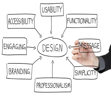
To present those ideas on a website you have to know which elements of web design are. There are lots of elements but I will mention those key ones:
- Color – color is one of the most important things you must think of when creating some design. I talked a lot about colors in one of my articles called “Color Trends in Online Sales” so go ahead and check it out to find out which color you should use.
- Graphics – graphics include your logo, icons and different photos that are used to improve and make design look better. All that graphics must be placed on the right spot and must be in good relationship with colors and every other aspect of the design.
- Layout – layout of the website is its basic look. Layout is important because you must know how to place content, graphics and other stuff well.
- Font – another important element are fonts. Most of the designers use basic fonts that work well on most websites. Don’t use fancy fonts because it won’t look good.
- Content – “Content is king!” content is the purpose of the website. If visitors can’t find a content that is not relevant or interesting they will go to some other page.
Design factors that influence visitors
There are lots of factors that can influence your visitors and bring you more or less traffic to it. Firstly, let’s take a look at a loading time of the website. If you design your website poorly and place bad pictures there it will take a lot of time to load the website and you surely don’t want that. Some stats say that people leave the websites that take more than 3 seconds to load. Average wait time for website to load is 2.078 so make a good design to lower your loading time of the site. There are also stats that show how sites that load in less than one second get a traffic growth of almost 5%. Websites between one and two seconds get a traffic growth of 2% while websites with four or more seconds loading time get negative traffic growth.
Another very important factor is color scheme. Just like I said before, read my article about color trends to get more detailed information about colors. The important thing to mention here is that websites with dark color schemes get a traffic growth of 2% while sites with light color schemes get a growth of 1.3%. Mostly green websites have a growth of 3%, blue websites are second with 2% and purple are third with 1.6%. Red websites are not so good and their growth is in minus, -1.35%.
On to the next one. Layout is another important factor that can have a great influence on website visitors. Visitors like to see websites with F-shaped pattern and Z-shaped reading pattern. And when you write content make sure that first two paragraphs are good because lots of visitors concentrate only at them when they visit the website and start reading. Your subheads should also be attractive because those are the things that visitors see first, with bullets points and paragraphs.
Trust! That is the big factor that can attract your visitors or scare them away. Over 90% of people say that design of some website can make them lose their trust to it. So, what can you do to get visitors trust? There are lots of things like including links to some media coverage, avoiding stock photos and pre-made templates and showcasing your followers on social media networks.
So, that’s it for the first two paragraphs? Fell tired? Well don’t go yet because now that you know what web design is, what are its elements and factors that can influence on visitors it is time to learn what to do and not to do when creating some design. Keep reading.
5 things you should avoid
I could write a lot of things here because there are probably endless advices on what to avoid in web design but I will list only the most important and the best ones.
- Navigation
Always take your time with navigation. Bad navigation can really make visitors angry. Navigation can be bad because:
- it looks unclear
- it looks complicated
- it has broken links
- it has bad names for pages
- it doesn’t include search bar
Try to test your website every month and check for any problems I mentioned above.
- Background
There are people love backgrounds and there are people who don’t but there are things you can do to piss both of these people off. For example:
- backgrounds placed under text that make text hard to read
- backgrounds that attract attention and visitors can’t focus on content
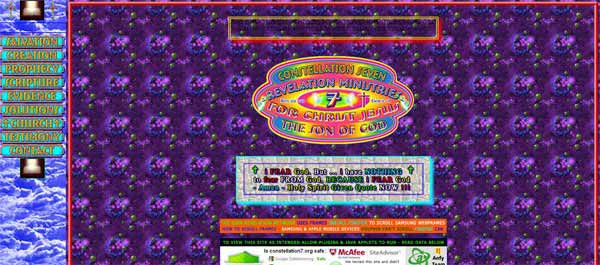
- backgrounds with lots of details that gives you a headache
If you use backgrounds on the right way then they can improve the overall design of your website but always be careful with them.
- Images
Images can give you more problems that you would ever think of. Always avoid:
- large images that slow the loading time of your website
- images too big for screen
- images that don’t have Alt tags
- large thumbnails
Use optimized images to improve loading time of your website and don’t overuse them.
- Links
When you place links to your website you have to make them attractive and easy to read and go to. Avoid:
- broken links
- low contrast links
- putting the links in same color as your text
- links without description
Make them look good and clear.
- Text
You can do everything great but if you make your content look bad then there is no use of amazing choice of colors, graphics and other stuff. When placing some text try not to use:
- small text
- bad fonts
- bad contrast on text
- underlined text
- colored text
- bold, italic or caps text (you can use it for one word but not for an entire paragraph)
Just like I (and everyone else) already mentioned, content is the most important part of the website and if you go wrong with that then everything else won’t be enough to keep visitors on your site.
And those are the most important things that you shouldn’t do. Keep reading to find out what you should do.
List of web design tips
Our last paragraph is actually the main topic of this article and (maybe) the reason why you are here. I decided to divide the tips I will mention below in four different categories – design, user experience, content and development.
Let’s start with design.
- Investigate – before you start doing anything with the design you must find out who is your audience and what they expect from you.
- Colors – don’t use more than two or three colors
- Security – make sure that your website is secure.
- Organization – make sure that everything on your site is well organized and that it looks clean.
- Be original – when you make some design you must make sure that it is original and unique. Don’t use already finished themes, especially not free ones that are available to everyone.
- Trends – always follow all the latest trends.
- Testing – when you are finished with your design always test it, check if everything is functioning on the right way and ask someone be test it for you. That can be your friends, family or some people on the internet.
Now to the user experience tips.
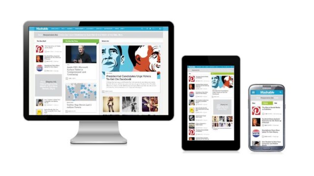
- Responsive design – few years ago responsive design was a great innovation but today it became a standard. Make sure that your design is responsive because more and more people use smartphones, tablets and even TV’s to browse internet and websites.
- Fonts – when you design website you have to make sure that font is simple, clear and readable. But you should also make sure that the same font will be easily readable with all devices.
- External links – when placing some external link always add target=”_blank” to it because people will want to open some other website in new window.
- Forms – when creating forms make them simple and short. And try to avoid captchas.
- Auto-complete forms – make sure that all forms you create can be auto completed with all browsers.
- Contact information – place your contact information on every form and on contact page or footer.
Well done, you reached to part with content tips.
- Pages – your website shouldn’t have large number of pages. Create only the pages you need. Another good thing is to keep pages long enough but not too long.
- Homepage – homepage is a place where visitors come at first and then go to other pages from it. Don’t put too much of content to it.
- Content is king – I already mentioned this phrase above and I mentioned it here again. Why? Well, because it’s true. Write interesting content that is useful to visitors because if you don’t then nothing else matters.
- Photography – people say that one photo says more than a thousand words and it is true. If you are explaining something it is good to put text and photo instructions. If you are describing some product or service photos will help you there too.
- Video – another good way of presenting some product or service is with the help of a video.
- Blog – if you want to look active then blog is the west way for showing that.
- Social media – with the help of social media networks you can create a group of loyal audience and promote your brand. If you don’t know how to decide which social media network is right for you then you can find more information about them in my article called “Social media platform comparison”.
And the last part are tips about development.
- CMS – one of the mistakes that developers and designers often make is to build their own CMS. Don’t bother with that, just pick one out of many available content managing systems out there.
- Speed – large images can slow down loading time of page. But bad coding can do that too. Test the loading speed of your website and try to keep it under 2 seconds.
- Special effects – believe it or not but special effects are a bad idea for most websites. Yeah, a little is OK but too much of special effects will create a distraction from the main content.
- Experimenting – it is a good idea to start experimenting with new things that can make your website look better.
- Learning – always continue learning about new technologies, tools and all other stuff that will improve your designing knowledge.
Congratulations, you reached the end. All the tips I mentioned above are just a part of great collection of 69 tips which you can find in the infographic below. Enjoy!
