What is Material Design?
Did you know that new version of Google Android OS named Lollipop was introduced with codename Android L? And it was actually the first complete introduction of Material Design. Have you ever wondered what Material Design UI is?
Some people will say that it is just change of Android OS looks so it could look modern and clear. But, it is not correct. Material Design UI is a whole set of rules and guidelines to make mobile software work right, no matter of Android device that is running that OS. This new designer language is based on the possibility for users to receive information on natural way just like they do with physical objects and to understand the technology that they use every day.
Google believes that Material Design can secure a much need combination between simplicity and flexibility.
What else you need to know?
Well, it is interesting that Google Material Design isn’t completely new. Back in 2011 we go a new design of Google mail client – Gmail. Most important changes included some buttons that were flatter than before and a good use of whitespace and margins. Just one year later Google changed another thing and gave us popular “cards” which we use today and they presented even more whitespace. All those small design changes weren’t made just to make Gmail look better, those changes were part of a process, a process of creating Material Design UI.
Google Apps with material design
Since we got a new OS with Material Design UI Google decided to update some apps and create Material Design look for some of their most popular apps.
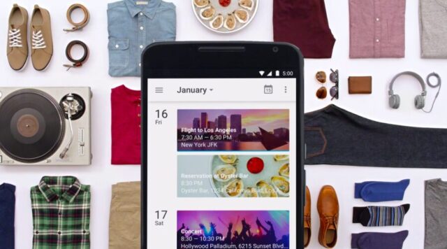
Google Calendar 5.0
If you use this app then you probably know that this app wasn’t redesigned for a long time. Finally it got its own Material Design style and now it looks beautiful and has some more great options and features.
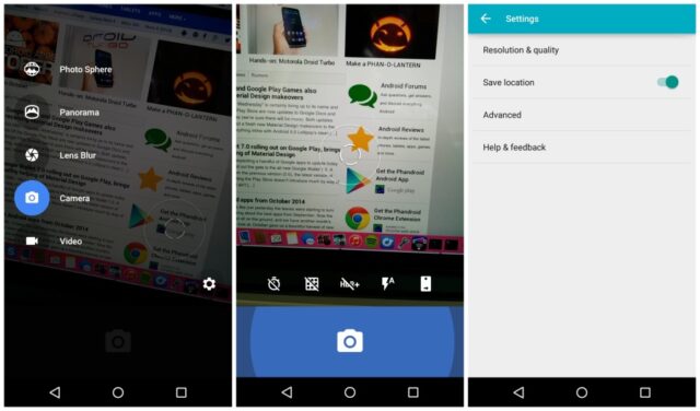
Google Camera 2.4
Google Camera was also updated and got some nice features and Material Design style. It also got some new animations and few new colors. Very nice update.
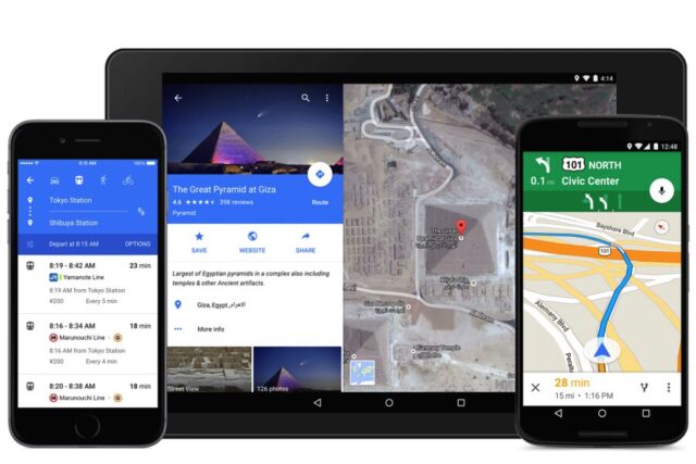
Google Maps 9.0
Finally we got an update for Google Maps too. This app looks much better than its predecessor and now it is a must have app.
Gmail 5.0
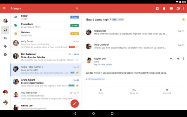
Other apps could be a little jealous to Gmail because it got probably the biggest redesign based on its look. But, it also got some new amazing features like a possibility to use Microsoft Exchange mails and Yahoo mails at the same time.
And that’s it for this part. I hope you learned something about Material Design and that I got you interested for that field of design language. If you decided to get more familiar with that language and want to use it and create some stuff of your own I recommend you to continue reading.
Material Design principles
Before you do anything more you should decide if you really want to learn Material Design. When doing something in design field it should be unique, like you already know. And when you think about everything you can do with material design you should think about what you want to make with your own design.
So, thought that trough? If you did and you still want to learn more about Material Design then great, keep reading. Below I will list some Material Design principles and guidelines.
1. Google resource
Before you do anything more you must read Google resource for Material Design. It covers everything about Material Design and you will learn some of the basic stuff about this.
2. What does Material mean?
If you read everything from the link we recommended in the first guideline then you should understand that the goal of Material Design is to present design like the real world. People can feel material, right? When you put your hand on the wooden desk you know its wood, when you touch metal, you can feel metal. But, people can also recognize some material that is placed on other material. If you have wooden door and metal doorknob then you can recognize it. Now apply that thing to Material Design. Apply the same hierarchy you have with wooden door and metal doorknob to UI design, which is the goal of Material Design.
3. How to create that hierarchy?
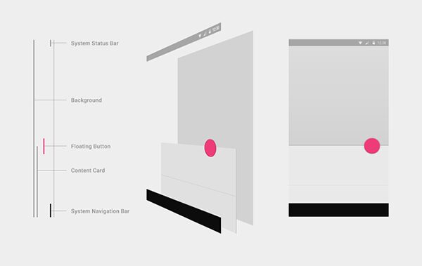
To create something like that you must use shadows, lighting, edges and Material Design tools. The most important part is to add some depth to your objects. But, first you need:
Colors should be:
- Bold
- Graphic
- Intentional
Those are the most important color rules when creating something with Material Design. If you use colors based on the three rules above then your design will look more fun and interesting and therefore be effective when interacting with users. Below you can find an example of great use of colors.
5. Whitespace
Whitespace is very important part in Material Design. If you use whitespace on the right way your design will look modern and it will be effective. Whitespace will get attention from users and create focus on important stuff. Example of good whitespace use:
6. Images
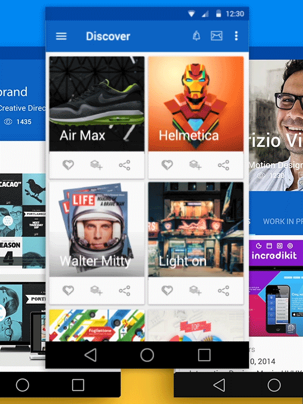
Material Design is image friendly and if you include some pictures to some part of your design they should have and important part. Images in Material Design are “edge to edge”. What does that mean? If you look at the picture below you can see that the edge of the window and image edge are connected and there are no margins between them. Research proved that this type of design is more interesting to users and gives them a different experience.
7. Motion
Motion is one of the most important parts in Material Design. When you are in the real world you can see motion. In fact, you experience it all the time. When you include motion to your design it helps users to understand how some stuff work and where to focus. If the clicked something then an animation should appear to confirm that the button was pressed and action was performed.
8. Details, details and more details.
You should present something simple in a complex way. That sounds simple, right? Well, not really but that is actually part of Material Design that makes the whole language so hard. Every element of your design should present the same thing from real life but on detailed way.
That’s exactly why some people say that Material Design is a “simple game of details”. For some examples of great Material Design projects check the gallery on behance.net.
And that’s it, for now. I believe that Material Design will continue to develop even more and I will try to bring you more information and more instructions and guidelines on how to use Material Design and start your career in that area in the future. Enjoy and tell us what you think about this new design language! Below you can check amazing material design examples for download:
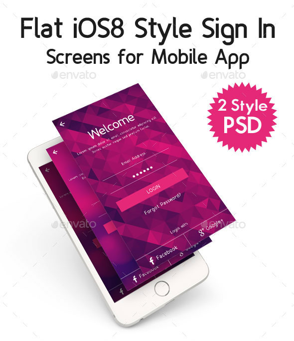
Flat iOS8 Style Sign In
Created with Adobe Photoshop CS5.1. Dimension: 1242×2208 pixel perfect for retina display. All elements are customizable. Preview images are included in the package. Download here.
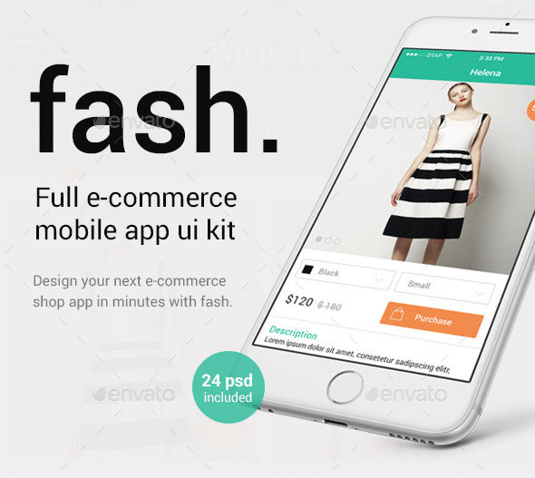
Fash – A Mobile E-Commerce Shop UI Design Kit
Fash is your perfect clean iOS8 Mobile E-Commerce Shop Ui Design Kit. It comes with an eyecatching style focussing on awesome mobile shopping experiences on mobile devices. It’s optimized order and checkout process provides you the best components to start your own mobile E-Commerce from scratch. Download here.
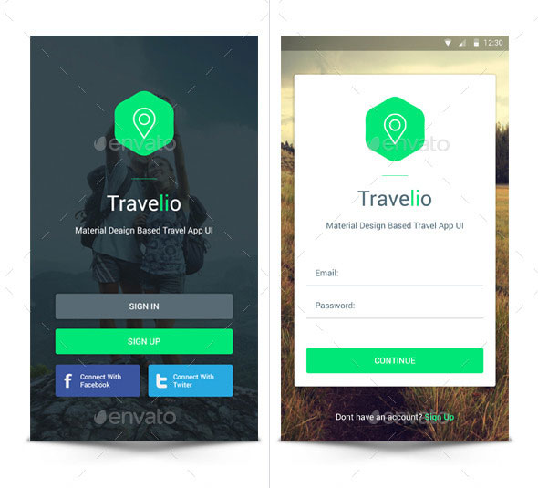
Material Travel App UI
Material Travel App UI. Main Features: This Material Travel App UI inclues 17 PSD file all organized. Google Material Design. Completely editable layers, all icons, button and shapes are vector. Download here.
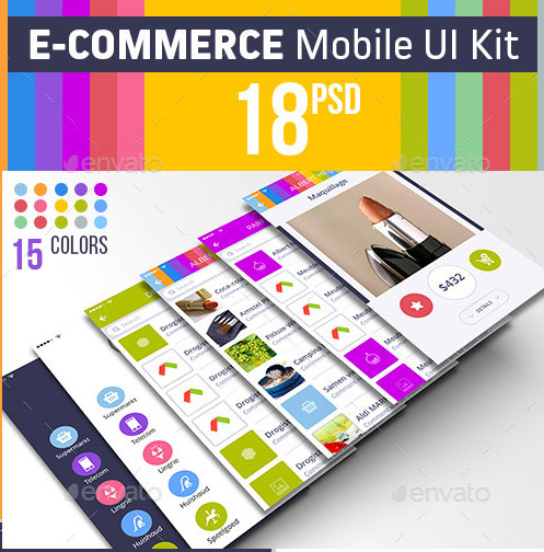
E-commerce Mobile UI Kit
“E-commerce Mobile UI Kit” carefully designed user interface for mobile shopping App features 18 screens et” 15 colors, which you can build iPhone or any Android application with ease. Download here.
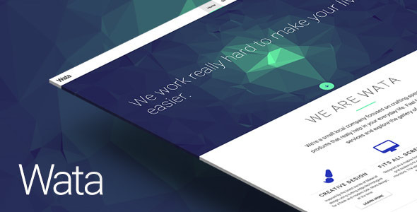
Wata — Material Design Multipurpose Template
Features: Ajax MailChimp form. Bourbon library. Font Awesome icons. Masonry grid. Materialized framework. PHPMailer contact form. ScrollMagic animations. Shuffle categorized grid. WebGL animations. Google map. Built with Sass. Automation by Grunt. Download here.
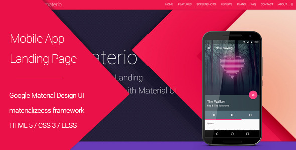
Materio – Material Design Mobile App Landing Page
Materio is a one page template for your next android mobile application. This template can be used as both landing page for your campaigns or as a complete one page theme for an app. Materio template is designed and developed in mobile first approach so that it can provide best user experience on any screen size or device. It is built on materializecss. Materio is built with LESS CSS preprocessor so that you can customize this theme’s look and feel with few lines of changes. It has email subscription and contact from sections to collect emails and contact information. You’ll have pre built 5 color variants to get started. Download here.
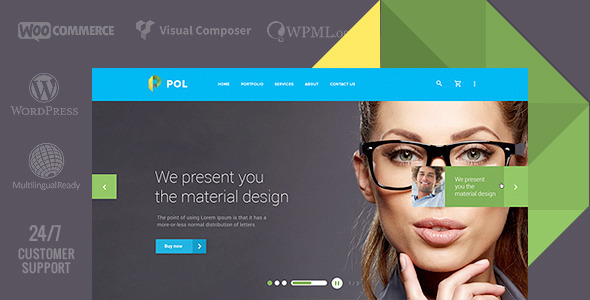
POL – Material Multi-Purpose WordPress Theme
Theme is designed for all lovers of bright material design! Universal theme suitable for corporate websites, online stores, personal portfolio, agencies, start-ups and many others. Download here.
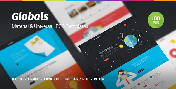
Globals – Material & Universal PSD Template
Globals is a multipurpose PSD Template for your projects. Advantage of this project that it includes 5 concepts in one. They are: Hosting, Finance, Portfolio, Directory Portal and Medical. The archive includes 100 PSD files which are implemented in style of material design. Bright, flat and what is the most important – is that it`s a universal template which will become good base for your projects. All layers are sorted and named and it is easy to be guided. All flat cartoon graphic elements and icons are included in psd, they are free for commercial use. Download here.
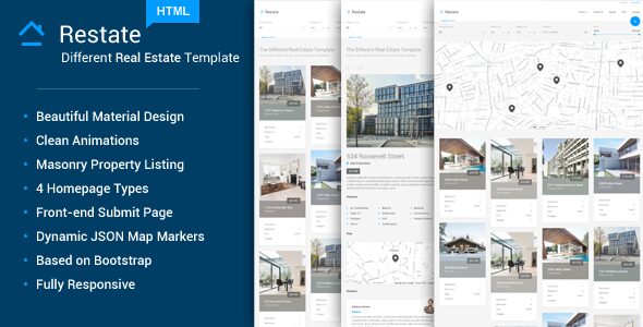
Restate – Different Real Estate Material Template
Restate is beautifully crafted material design Real Estate HTML Template. This template is designed with one main idea in mind – to be different and bring new experience for user when browsing the real estate site. Thanks do material design, the template is clean and simple so user will focus only on important content. Awesome animations guarantee the best experience in Real Estate templates. Download here.
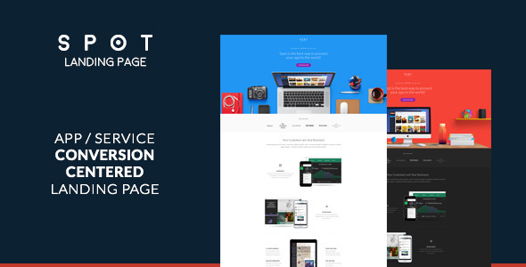
SPOT – App / Service Landing Page
Landing page designed to present your app or service the best way it deserves and convert visitors to users. Increase the ROI of your marketing. Build your landing page using SPOT. Download here.
