While today most of the world accompanied the news about Google’s new logo with mild interest, the technology industry had searched every inch of this news. What does this mean for Google? Why it’s look like this? We only can say that the new look reflects what Google really is – effective.
The final proof that Google’s design is more efficient than Apple’s?
Fortunately, Apple pulls pairing of hardware and software – in fact, we are convinced, that iOS installed on a random Samsung / HTC mobile phone, would not look so good. Unlike Apple, Google is guided by raw efficiency. Google’s design is not only mathematically, no longer tests over 41 shades of blue, but the efficiency is still the number one.
Because, of course, Google knows that the software itself is not the purpose. It is not the purpose of aesthetics to be aesthetics. It is not the purpose of the blue button to be blue button. The point of the software is in the results that the software provides, not in the software itself. The purpose of the Google search engine is not only the search engine, but to users as soon as possible reach the requested page. Google’s design, aesthetics and visual communication are doing everything to users reach the finish line, whatever its purpose was – a site that has a search result, the location on the map, route, documents …
Known branding in minimalistic attire
Further to this, the Googles’s new logo actually derives from the current state of all of Google’s design blended with distinctive branding.
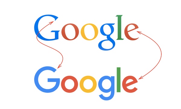
Google’s new logo is the minimum possible typography – the letter “o” is a circle, the letter “l” is the only line. The absolute reduction of all unnecessary. What’s left are the colors as the foundation of the brand, “notch” to the letter “G” and slanted letter “e”. The colors and these two details of typography have been transferred from the old brand, and everything else is removed. A visual minimalism in the least possible time and visual overhead says: “I’m Google”.
This logo will serve Google for many years, even we think it will be difficult to evolve, because the further evolution should or remove Google’s distinctive colors or details of typography, which we think it will be difficult to pass. What do you think about Google’s new logo? We think it’s gorgeous! Below you can check video about Google evolution and find out how Google has changed over the past 17 years:


