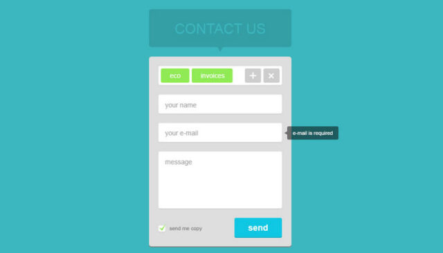

Your contact page on website could simply break or make those conversions from visitors. For big number of companies contact page is just something that is perceived as ” elephant in the room ”. But, when you see from various analytics that this part of website is one of most visited, you’ll change your mind. It could happen that someone had a nice experience on your website until he get to the contact page, and then it all goes down the rabbit hole since that page failed to attract that click, which means your future customer is quite possibly gone forever. At its core, the goal of contact page is to attract customer to your business while at the same time building mutual trust. If you own website, think of contact page creation as one of the crucial elements. Website is after all one of the most effective tools any business or company can have, and contact page should not be barrier but rather an entry for people.
First what you’re going to do is start talk to your targeted audience and not yourself. So logically, there are some rules which you should follow in order to create successful contact page. Don’t create to much required fields, limit them so you can ask and get only the crucial information you really need. If we ask too much details from visitors, there are high chances he or she will not finish the contact form at all. Placing bounding boxes around forms is a great idea because it’s much easier for people to see what parts of site are interactive and what are not. Put the location of your company. Do it with embed google maps, it’s very beneficial and it adds the credibility.
There was one study which surveyed more then 1,886 websites in various fields like development, coaching, design or advertising and what was found is that almost 40% of companies are offering just a small contact form or email at the bottom part of their webpage. When speaking about credibility, put some social proof or testimonials from people, or even how much years you are in the world of business. You probably know that customers are going through few websites opened in many tabs, so if you wish to remind them who they are going to contact add a branding too. Make different media forms. It should be feast for any visitor.
Consider using timelines, videos, photos or even infographics. On top of it, remember to keep it simple, it always win and especially with mobile platform. Even though you included location of company, put your phone number also. A lot of companies don’t like to include their number because they think their phone is going to ring whole day but your phone is almost the same like Google maps. It will give customers sense of credibility and they will hand their details more safely. All examples I have written can be effective but that doesn’t mean you need to stick strictly to them. Try to add your own unique techniques and twists. If you want to craft the contact page you need to understand what your brand is about and what visitors want to find out. Having the unique approach and big imagination could help you along the way of sustaining, creating and strengthening that interest in your brand when people click on your contact page.


