The online e-commerce business grows and expands every year. It is imperative that the e-commerce tycoons take it to the next level to bring in customers. A crucial component of an e-commerce website is the checkout page. The checkout page can make the user experience exceptional and almost always makes the user come back for more.
Designing the Perfect Checkout Page
During the process of designing a checkout page, there are many considerations, such as functionality, usability, security and design. However, design, out of all the other aspects, can play the role of a trump card in your website. Here is how your design team can enhance your site’s checkout page to make it a great experience for the user.
Visuality
E-commerce websites are basically virtual shops and stores where the users purchase his/her personal products. To attract a lot of customers and let them experience a virtual shopping satisfaction, the websites must look attractive and visually appealing.
After adding their desired products into the shopping cart, if they are directed to a basic and bland checkout page, you may risk the chance of losing a returning customer due to its lack of appearance.
Here are some visual ideas:
- Every product should have an icon that shows what the shopper is purchasing.
- The company logo should stand out and always be visible throughout the pages of the site.
- Maintain a color theme and share that gradient palette to make your site presentation more vibrant, consistent, and attractive.
Transaction Authenticity
There are many people who shop online and fear the safety of spending their money in the virtual market. In order to build their trust, it is essential to provide accurate security and authenticity certificates.
Always include the logos and terms of conditions for the certificates, so the users know what they are getting into and assured of quality product and services.
Having a well-designed and clear structure of payment options help the users feel more assured. This allows them to know that they are in the right hands, which can build a good reputation for the company.
Enlarging Images
It is very important for the website to guarantee their customers they will be getting what they are paying for. Sometimes it is a good idea to have a product recap on the checkout page with large images and details. This way, users will feel assured before they click ‘checkout’.
One way to do this is to create big thumbnail images for items on the checkout page. Another thing you can do is to put a brief product recap with links directing to their respective product segment. You can even provide similar products to entice the customer into adding it to their shopping cart.
Use Tables
An average user spends less than a few seconds reading through web content or information that is provided. Thus, if you want your e-commerce site to attract and hold the user’s attention span, you need to be very articulate and creative in your presentation of information. Your information should be organized in a way will not cause the user to feel overwhelmed.
Information on the checkout page needs to be organized and precise so that the user isn’t confused. A tabular structure can best suited the presentation style for the checkout page. In this way the items are sorted along with proper serial number, quantity, price per product, and any other relevant information. By presenting a clear information to customers, it’ll be easier for customers to checkout.
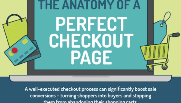
Online shopping and e-Commerce is a multi-billion dollar industry that spans the globe, and many manufacturers and sellers would like to have a small piece of that massive pie. One of the biggest problems facing designers for e-Commerce sites is how to prevent cart abandonment. Here’s where this infographic by VWO can help. The infographic discusses the state of abandoned carts as well as the four elements integral to the perfect checkout process – design, security, usability and functionality.
If you want to know how to perfectly design e-commerce website, check one of our article.


