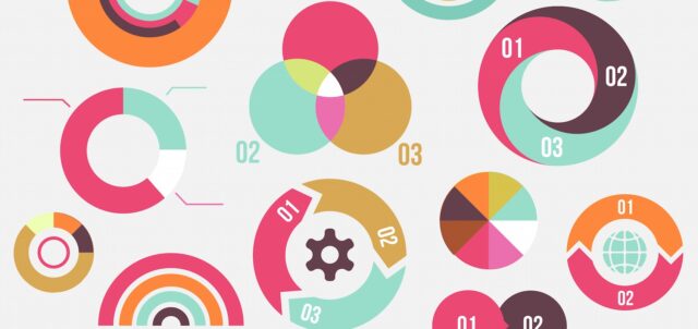
I wrote a lot about infographics. I said what it is a lot of times and there are lots of articles with advices about creating a perfect infographic that will look cool, help people and go viral. But knowing a little bit more surely can’t hurt you. So, if you want to maximize the performance of the infographics that is being created simply read this article up until the end.
Let’s just repeat the basics one more time. What is infographic? The word “infographic” comes from two words, “information” and “graphic”. From that it’s pretty easy to see that infographic is a graphic that contains some useful information. If you want some more correct definition then we can say that infographic is a visual representation of some information, data or some expert knowledge. That information, data or knowledge is presented in a quick, clear and attractive way.
The first known example of infographics was used back in 17th century hen Cristoph Scheiner created a book where he used infographics to explain some things like patterns of sun rotation and similar. Another notable mention of infographics happened in 19th century when Mr. Nightingale decided to create a special infographic to help with his goal of improving military hospitals in England. Infographics was used in 20th century too and there were even books explaining the meaning of infographics to people. But the popularity of infographics started to grow in the 21st century when it was transformed into digital format. In last few years, infographics is widely used by lots of internet pages and people often choose to create infographics instead of writing some information, data or knowledge.
Why is infographic effective?
In the ending of the paragraph above I mentioned that lot of people choose infographic over traditional articles about some information, data or knowledge. Why is that? How come infographic is so effective?
Well, if you look at all the things that infographic gives you it’s easy to understand why people like to use it. There are two main parts where infographics can help you the most.
Data visualization. One of the main benefits is the ability to visualize everything. You have to know how to present some big data and numbers but also make them clearly visible and easy to understand. And the best practice to do that is to use infographic.

Graphic information. Another great thing about infographic is that it presents some useful information in fun way. The main goal of some infographic is to give some useful information to people and if you create it on the right way the information will be passed to users on efficient and effective way. Infographic can be used to describe different things like process, anatomy or hierarchy. You can present that information in form of some charts, timeline, diagram, illustration or any other way you want.
But that’s not all, there are lots of benefits that infographic brings with itself. Some of those benefits are:
- Attractiveness – people love statistics, figures, facts and similar stuff but only when it’s combined into attractive images and graphics.
- Easy to read – did you know that about 90% of information that enters the brain is visual information? Information placed into infographic is easily viewed and scanned so people will remember it better and will like to read it.
- Sharing – if you create some great infographics there’s a large chance that it’ll go viral. Why? Well, it’s really easy to share infographics on social media networks.
- Embedding – another great thing connected to sharing is the ability to embed the infographic on websites. Your visitors can use a simple embed code and put your infographic on their website.
- Brand awareness – if you create some good infographic and include the company name and logo in it it’ll help you to increase the brand awareness and create better popularity and trust for the brand.
- SEO – just like I mentioned above, if the infographics is good people will share it. And every time someone shares your infographic on social media networks or embeds the code on their website you get a backlink and that could lead to better ranking of the site on search engines.
Now you know why people like to use infographics and why it’s so effective. Keep reading to find out some more useful information.
Infographic Types
There are lots of different infographic types. The real question is, which one to use? Don’t worry, once you figure out the type of information you are going to put into one you’ll know which one to use. But first, you must know all the options.
- Statistical infographics – this type of infographic is mainly based on data visualization with lots of tables, numbers and graphs. If you want to tell some story with numbers then you should use this type. For example, infographics that should present some results of surveys, business reports, data news and all other statistics should use statistical infographic template.
- Informational infographics – these are infographic templates that present information. Simple as that. They can use informational posters, brochures, presentations and similar. When creating informational infographics it is a good practice to use list, bullets points, illustrations and similar.
- Timeline infographics – you know what timeline is, right? Well, then you can realize what timeline infographic is. Timelines are extremely useful if you need to tell a story that follows some chronological time period.
- Process infographics – if you need to present some information flow then you can use process infographics.
- Comparison infographics – how will you compare two objects, brands, places, theories or something similar? Well, with comparison infographics. With this type of infographic it is easy to present the differences, similarities, advantages or disadvantages between two things and create a guide for choosing one or another.
- Interactive infographic – this is probably the most advanced type of infographic. It is web based and interactive and its main purpose is to allow visitors to explore around the infographic and find out information they want.
There are also some other infographic types like geographic infographic, video infographic, hierarchy infographic and similar but the ones I listed and explained above are the most popular ones and probably the choice for your infographic.
10 rules for effective infographics
All the benefits I mentioned above won’t happen if you don’t create your infographics on the right way. You have to know how to create it or you can pay someone to do that for you. To create infographics on your own you’ll have to follow 10 important rules.
- Goal
Before you even start with creating an infographic there’s some things you have to figure out. First of all, what are the goals? What are you planning to do with the infographic? Are you planning to simply entertain people? Or to educate them? Or your plan is to create better image for your brand and get more customers? Once that is figured out it’ll be easier to decide on the infographic format and what information to put in it.
- Audience
The second rule is to decide on the audience. Think about the people you will present the infographic. Are they serious businessmen? Or they are teens? That’ll help you to give some funny or serious style to the infographic. And think about the language that audience talks. You can’t write something in Spanish if the most of the audience is from USA.
- Create a core
The third rule to follow is to create a central point of a message or story. Every good infographic has a central idea. Think about what you want to say.
- Relevance
Average user will spend about 3 minutes while reading your infographic. Can you tell the whole story you wanted in those three minutes? To do that it’s important to keep everything short and simple and divide the whole infographic into 5-10 blocks. And the most important thing is to tell something new. Don’t repeat some old stuff, people probably know that already.
- Research
One of the most important things to do before creating an infographic is to make a detailed research about the topic of your infographic. Think about where you’ll get the information that you need. Will that information or data come from your company, from competition, internet, social media networks or from some other place? And always collect all the relevant data and information.
- Header
Header is one of the first things that people see when they see your infographic. That’s why it has to be persuasive. About 90% of people will read the infographic because header caught their attention.
- Design
But having a good header is not enough. It could attract some attention in the first place but if the rest of your infographic has some bad design people will give up from reading it. Always try to create some eye-catching design. And good thing to do is to highlight all the most important information and create a clear difference and distance between different blocks.
- Sharing
It’s not worth creating a perfect infographic if it won’t go viral. Always submit infographic to all the major directories like:
- Daily Infographic
- ly
- info
- Infographics Archive
- Infographics Showcase
- Visual Loop
- com
And register on all the major and relevant social media networks and share your infographics there. Another good thing to do is to send it to related blogs you or your friends have and share it there too, it can’t do any harm.
- Source
Your infographic has to be authentic so don’t forget to add the sources in the end. In that way people will know that you got all that information from more places and didn’t just made it up.
- Summary
And in the end you should write some conclusion of your own. Just say what you think and be creative.
That’s it! Learned something new? I hope so. If you created your own infographic feel free to share it with us. Good luck!


