When you are making a website or some web application you realize that technology and web industry became very complex and that much has changed. It is not enough to optimize your site to Google rules, now you must optimize it for users too. Ask yourself, does my app give a pleasant experience? Can my users use it easily? Can they see everything important at once? If the answer to any of these questions is “No” then there is something wrong with your UX design.
User experience is a way that visitors feel when navigating through some website or app.
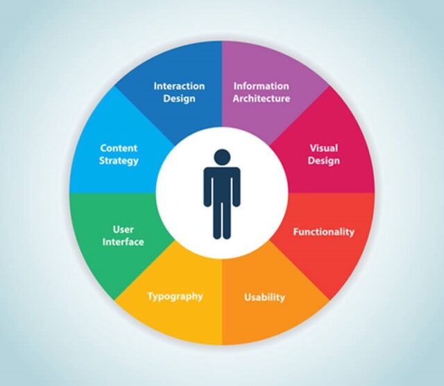
People who work on making UX good are called UX designers and those people must find out how users feel when using some app or website and then fix it if there is something wrong. UX designers should also check for every other errors like checkout processes on web shop. User experience is pretty new field but it is becoming more and more popular.
What is so important about UX?
First of all, because of good user experience. Obvious, right? If you visit some site and get some bad experience there you probably won’t come back, unless you don’t have other choice. So that website lost you as a visitor and gave more traffic to his direct competition. That doesn’t sound very good. It doesn’t matter how many features and cool stuff your system has, if you don’t provide good UX then everything else won’t matter and users will leave.
One thing that goes with that loyalty of customers because of good UX is money. If you provide good UX then customers should and probably will come back to your site and will buy or use services or products that you offer. In that way you will earn more, much more than with bad UX.
Effective system is another great advantage of UX. Imagine that you are buying something on for example, e-bay. You have an hour to buy what you need but because of great design and simple interface everything is done in 10 minutes. It is likely that you will spend other 50 minutes browsing the site and maybe buy something else. But if everything is messed up and you need an hour to buy something it means that the whole system of that shop is not good and because of bad UX you won’t return to that site and maybe even won’t buy the thing you came to buy.
Good UX examples
Now that you know what UX is and why it is important you should know how good UX design looks. I created a list of websites with some of the best UX ever seen. I hope you will get some inspiration from this list.
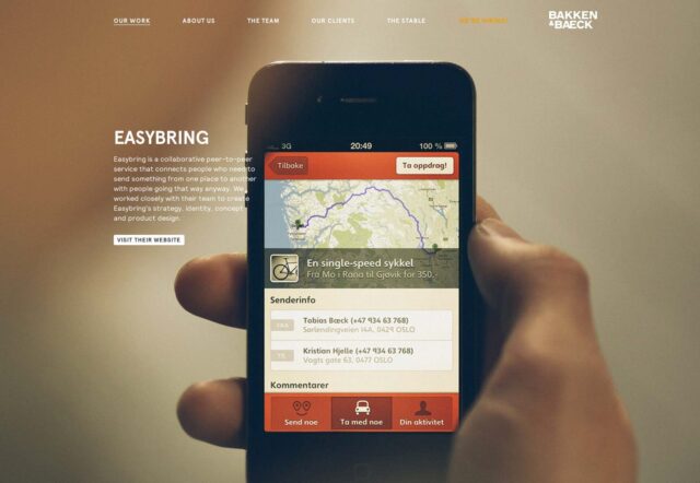
This is a website from an agency in Norway that will help you to convert your idea to a product. Great thing about this is that you can scroll over website and view their works with your keyboard.
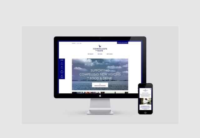
This portfolio website from a designer Andrew Jackson looks simply amazing. You can navigate through the whole site with navigation keys. Everything is where it should be and you can just enjoy when navigating the site.
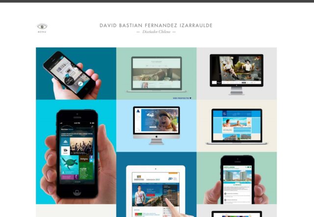
This is a website from a designer called David Bastian. His online portfolio is very clean, modern and it is very easy to navigate through it. It’s is beautiful to look and enjoyable to be on. Exactly how an online portfolio should be.
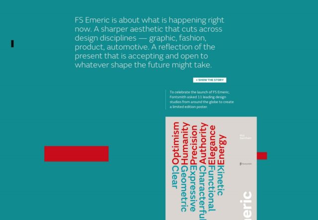
How about a website that presents a font? This font was made to satisfy future needs for good font to be used in design. But it’s not enough just to create a font. You also must present it on a good way and that is exactly the purpose of this site. It is very creative and, like its font, has some futuristic style. Great website with amazing UX.
Can you imagine coming to some site in foreign language and immediately knowing what does the site and business do even though you don’t understand a single word? This is exactly how this site is designed. You can translate it but it’s really not necessary because you can know what is happening in this agency just by scrolling through the site. Creative, awesome and fun website.

Bad UX examples
I think that we talked enough about good websites and apps. It’s time to present some of the worst UX designs, just to show you what you shouldn’t do and how your system shouldn’t look.
Those little animations on the site could look cute and cool at the start, but after a while it is really annoying and you just can’t wait to get out of the site.
If I go to some restaurant page it’s obvious that I want to find out their prices, location, number or something else and I just don’t want to be attacked with their “friend list” just after I enter their site. Very annoying popup window.
This site maybe looks good but it is amazing how bad UX design can be found here. When you enter the site it’s hard to know where to go. Maybe up? Or Left? Or maybe right? But you can go down too, you know? Just wow.
Consequences of Bad UX
From the examples I provided above I think you can see how a bad UX design can affect your customers. But, there is something else. Bad UX can affect you or your business to, and in another way. Here are three of the largest consequences of bad UX:
-
Wasted time
You take a lot of time to design a good UX but you’re not doing it right. That’s why you should make sure to understand everything about UX before you start doing it. It is proven that developers spend almost 50% of time on changing the original design.
-
Wasted money
Another big “benefit” of not being informed on design and development of UX is your money. The cost of your UX will grow every time you have to fix it. And you don’t want that.
-
Lost business
The third and the biggest consequence of bad UX is the lost business. At the end you could just give up or realize that it is just too expensive to fix your UX over and over again and just leave that business alone.
You can find more detailed information about this consequences in the infographic below.
I hope you learned something and remember to inform and find out everything about UX before you start doing it. Good luck.
