As the online world takes the domination of day to day life, the emergence of new websites and applications every single day is an inevitable fact. Due to that, online platforms and applications are competing to win over the virtual market. One of the most affecting factor that is key to invite more traffic is the design of the webs. To achieve the objective, many adopt User Interface (UI) design which focuses on catering the expectations and needs of the users’.
Below are the top ten UI elements that can help web designers ensure that the tall order is met.
1. A website story
A good platform usually creates a website story that displays real images and interactive content with messages that deliver the tone of authenticity. It is even better when accompanied by a mascot and direct connection to social media.
2. Navigation
Making sure that webs and applications are mobile friendly, using icons and providing buttons that lead to clear and direct actions are some things that make users navigate more easily.
3. Responsiveness
Meeting Google standards, simple use of columns, fluid grid layouts and drop down menus, application of parallax scrolling are the characteristics of responsive online platforms.
4. Accessibility
Labelled links, image alternate text, screen prime estate in which the content is designed and located according to the universal patterns, and monochrome settings are some of the things that make online platforms more accessible to their users.
5. Form follows function design
The shapes of the icons and other buttons should go with the principle of form follows function, in which the shapes or designs go with the intended functions. Some of the examples are click buttons, check boxes, and drop down lists. Visit Medium to find a list of user interface agencies whose projects can serve as examples.
6. Color themes
The use of vibrant colours and contrast can boost the clarity of the website content. In addition, it is better to pick colours suitable with common colours used for certain industries. For example, green for health industry, blue for tech industry, and yellow for food industry.
7. Font families
To handle this aspect well, it is good to know that fonts are practically divided into four classifications: serif, sans serif, scripts (font types that resemble handwriting) and decorative font type. Deciding which font types and the suitable combinations can be tricky, but when in doubt, Gothic seems to be the safest option. Applying highlighters and legible font types will also help boost the content readibility.
8. Image optimization
Vector is usually preferred and metadata should be minified. Further considerations, such as the formats of the images (among the three common options: jpg, png, and bmp) should also be chosen accordingly along and equipped with automatic scaling and suitable resolutions.
9. Minimalism
Redundancy must be avoided at all times to achieve the desired kind of minimalism. Simple use of big fonts and effective visuals have been proven helpful, as well.
10. Error elimination
Technical errors are known to bug users more than any other aspects. Maintaining error free platforms demands high level of professionalism. However, such huge responsibility can actually be shared with the users themselves by providing an easy access for users to give feedback and answering to it promptly. Also, errors can be taken more lightly should quick solutions be made available to overcome possible errors.
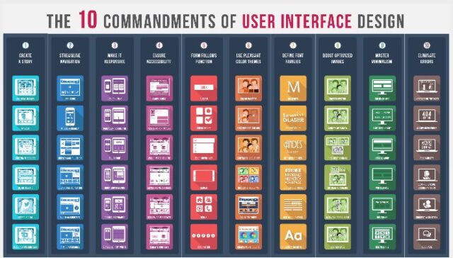
This infographic sums up the 10 commandments of User Interface design quite succinctly.
Courtesy of: Designmantic.com


