
When it comes to your business or website, logo is a very important item in branding and therefore it should be given special attention to it. Logo is what will people recognize and remember. Whether you personally design your own logo or you give the job to someone who would be able to make it professional – we will write some important rules of designing the persuasive logo.
It should not be too colorful
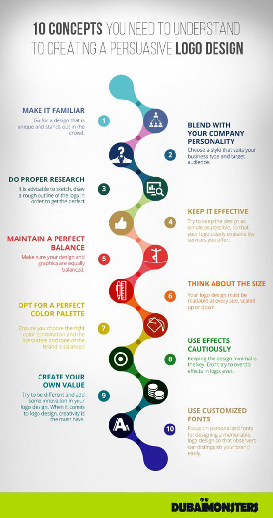
Therefore, in the design of any professional logo should not be used more than 3 colors. Check to see if your existing logo corresponds to this rule.
It should be quite minimalist ie. simple
In translation that means avoiding of all unnecessary things. All that is of no use to the logo should be deleted or even should never exist. The clarity, precision and conciseness are the characteristics that you must meet.
It is necessary that the persuasive logo is easily readable
The text of the logo must be written in normal font and size sufficient to be read with ease. So therefore when you complete the design you should check if it’s readable to all. If you suspect that your logo is not something that you will remember, or simply not enough about your business even enough alludes to what you might do, forget it. The logo must be recognizable.
Make sure that your logo is – unique
The shape of your logo must be original. Do not use already existing forms (layouts), but within them bring in it your own specifications.
A good and persuasive logo makes a good designer
Ignore all what others in the process of creating the logo have to say especially close person such as a parents, girlfriend or friends who are not in that business. In fact, if you are the creator of your ideas, then push it to the end.
Perfect logo is liked by everyone
It’s hard to get one thing that can appeal to everyone. But, for these opportunities three people are enough. So this rule is a three persons rule and the following applies: Your logo should be appealing at least 3 different people.
A perfect logo is not a copy
If you want unique logo, do not combine with something already existing that can be found on the Internet. Also never use clipart icons.
Excellent logo is just as great in black and white
This is the thing you need to be sure to check. Transfer the logo in black and white and see how you like it then.
A good logo is the long-term
Avoid any trends. Trends come and go, while only real brands remain. Imagine how it would be to Coca-Cola must change logo for a new trend. They did it once and recorded a tremendous loss.
We hope that we helped you to properly direct the thinking of the design of the persuasive logo. In the end, remember that the new logo will be your brand in the coming years.


