Few days ago I wrote an article where I gave you some ideas about blog posts and some tips for writing a good blog post. You can check the article here – 11 essential tricks for great blog post. But what I forgot (or actually didn’t want to) mention in that article are blog post elements. Do you know how to use them right? It’s time to learn. In this article I will explain every element to you and then help you to get the most out of one of them.
Elements of good article
These elements are part of the rules you should follow. There are 10 main elements that are important part of every article:
- Tittle/Headline
Tittle is the important part of the article because it directly influences on visitors decision about the article. If your tittle isn’t good and attractive then you won’t get visitors attention and they won’t become the readers of your post. Tittles are usually 6 to 8 words long, they are catchy and must be in H1 tag.
- Introduction
Introduction, together with headline, is the part of the article that will sell it. Explain the main points of the article, get readers attention and make them want to keep reading.
- Featured image
Probably not the most important part but you should always include it to article and try to make it good. It can be really hard to find a picture that will explain the content of your article. You can sometimes put pictures that are not completely related to the article, just to get attention.
- Content
What’s the point of great tittle and introduction if you don’t have a quality content that will satisfy reader needs? When you write something try to use short and clear sentences and divide text into paragraphs. Try not to write more than 2000 words because most of the people need about 7 minutes to lose attention and they will need a lot more to read more than 2000 words. Try to use bulleted lists for more important stuff, like I am using here.
- Sub-Headlines
Organize your post with sub-headlines tagged with H2. Use keywords of your article in headlines and don’t make it too long.
- Links
It is always useful to put links to other useful articles you or someone else wrote or name sources where you found information for your post.
- Graphical and media elements
To make your article look visually better use images, photos, illustrations, infographic, graphics or some video material. Simply put related image to some part of the article. You can find more details about choosing the perfect image in the next paragraph.
- Conclusion
Always include conclusion to the end of your article. Ask reader some questions or ask them to give their own examples or opinions about something you wrote in the article.
- Social media sharing
One of the goals of every article is to make it viral. Always include links for sharing that article on different social media networks.
- Comments
At the end of every article there should be an option for readers to comment something about your articles and ask questions. Try to make the comment section simple and easy to use.
Choosing a perfect image
Now that you know all the elements of the blog post it is time to learn something more about them and learn how to make them perfect. In this article I will focus on images. Just like I mentioned above, images are used to make an article look more attractive. But not just that, you can use images to explain some parts of the article better. Everyone can find some image and put it into article, but can everyone do it on the right way? Answer is, of course, no! There are few rules you should follow when finding and placing images into blog post.
- Copyright issues
This is one of them most important things you must watch for when picking some image for your blog. There are some sites like Shutterstock, iStockphoto and gettyimages which give you nice images but you have to pay for them. Another way to get images is to find photos based on Creative Commons license. Those images are free to use.
- Quality
Quality matters. If you have low quality images included to your posts then most people will think of your blog as low quality too. When you are picking images make sure that they are high quality. To recognize high quality image try to look for one with clear details, bright colors, good lighting and composition and without any blur. And also avoid images you used on other posts.
- Sizing
If you include some images of higher resolution to your post then its loading time could be longer and visitors surely won’t like that. If you pick low quality image then loading time will be fast but images won’t look good. That’s why you should try to resize the image to 500 pixels, which is recommended size of a picture.
- Relevance
This one is pretty obvious but lots of people make this mistake. Always, but I really mean always, use pictures related to your post. If your tittle and images in the post or featured image are not connected then it will look unprofessional.
- Attractiveness
When you find pictures that are relevant to your post then you must make sure that those images are attractive and interesting. Images are often the first thing people see when they open some larger article and if images are attractive then every other part should become more interesting too.
- Responsive
You probably know that people will visit your site and read your articles with smartphone, tablets and every other device. If images aren’t optimized for every screen size then it won’t look good and your visitors surely won’t happy. Will the image get over the text? Will it shrink or get larger? You have to think about that before you pick the right image.
- Placement
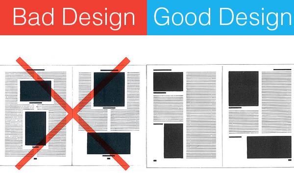
Always place images right. Don’t just put image somewhere in the article, try to put it somewhere close to the part of the text it represents. Or even better, include it into the text.
- Your own images
My last point is not a rule, it is more like my own advice for you. If you simply can’t find the right picture on the internet or you want’ to have something of your own then you can always create an image. If you decided to use that then there are some rules that must be followed:
- Lighting – take pictures near some natural light, never take them close to direct sunlight because they won’t look good.
- Background – clean background is a must! Create your own white background and take pictures in front of it.
- Angles – this is your own choice but always try to find some angle that will be good.
And another advice, place screenshots of something you are doing. If you are writing some article where you are explaining how to do something then add screenshots because it will be easier to explain and your readers will be thankful for that.
So, that’s it for now. When you write your next article remember to check this stuff here because it could be worth applying some of the rules here. If you need something else explained or you have some comment of your own then write in in the comment section below.


