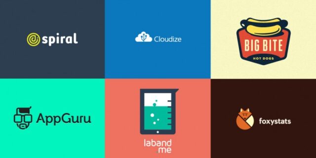
If you want it simple then we can say that logo is a symbol or a sing. But, you have to understand that a logo must represent something. Have you ever seen a logo and you just thought – “Man, this looks great” or you know exactly what some company does just by looking at their logo? Well, that’s exactly what a quality logo should do. Logo should present a company and its brand and because of its purpose it must be really, really good.
How to create quality logo?
If you decided to create your own logo for your brand or business then you are on the right place because here you will find most of the stuff that you need to know to create a quality logo that will be attractive and catchy. Put yourself in a situation we mentioned at the start of the article where you see some logo and it just impresses you. Can you explain why that logo is so good and attractive? Most of the times you won’t be able to explain that situation because the quality logos are simply good. You must create your logo in a way that it will take some information to the customers and help you with selling your product. If the logo is created well, customers will simply try that brand and maybe keep using it after, if they like it of course.
Before you start with creating a logo you must consider some things. Collect all the information you can about the company, its goals and customers they want to attract. Then try to draw something on the paper and try to see if some of the sketches present everything about the company values. Take your time because this can be very important. When you have finally decided for some looks of the logo you can start creating it. Always create your logo as a vector because vector format offers more scalability and it will look well in every shape and size.
Now to the main question, how to create quality logo? There are few characteristics that make a good logo and if you try to add those characteristics to your logo it will probably be good too. Those characteristics are:
- Logo is adjustable
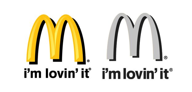
When you want to start advertising your product or brand you will have to include your logo everywhere. On the website, on the fliers, in the newspaper, on the business cards and on lots of more stuff. Logo should be flexible and adjustable to every situation. To make that happen logo should be designed in mostly one or two colors. Your logo should also be effective when in black and white format. For example, you can easily recognize McDonalds even if it is black and white because it is adjustable and looks good everywhere and in any format.
- Logo is memorable
One of the biggest reasons we create logos is to say something about our company. It has to be designed in a way to immediately attract customers’ attention and to remember you when they have to buy something that your company sells. To do that, try to keep it simple. Detailed logos are hard to read and if you put too much information or details then customers could lose their interest.
- Logo is recognizable
Customers should easily recognize a logo. That means that logo must be easy to understand to everyone. It also must be unique enough for your company so the users won’t be confused and maybe misplace your logo with a logo of other company.
- Logo is timeless
What do we mean by timeless? Well, take a look at this logo:

You surely know whose logo is this but can you guess when it was created? Back in 1887. YES, Coca Cola logo holds its original design for almost 130 years. And everyone in the world recognizes this logo. That means that once you create a good logo that customers will always recognize and you create some brand with it then you shouldn’t change it. Of course, small redesigns are always welcome to make the logo look more modern but try to keep it similar to the old one.
- Logo is relevant
Logo design will be more effective if it is connected to your company. That is exactly why you need to do all the stuff I mentioned at the start of the chapter and do a detailed search for all the information you can get about the company and its goals, vision and other similar stuff. Although your logo doesn’t have to be exactly about your business, it is more effective when your customers can immediately know what your company does. For example, take a look at this logo:
Well, of course you know it is a logo from Apple company, but try to imagine that you didn’t know it was Apple. Would you be able to guess from it that the company is producing electronics like laptops, tablets, smartphones and similar stuff? Of course not, but because of its high popularity people know that this is Apple’s logo at the same moment when they see it.
Examples of good and bad logos
Now, to give you some inspiration and to warn you what you shouldn’t do we created a small list with all the good and bad logos in the world. We’ll start off with the good ones:
The Lucky Ones
Milky Mug
ChocoPie
Union of Moscow Architects Brand
iGadget
Barknews Media
Sushi
Cook Eat Love
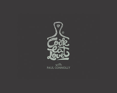
On Wine

Wiesinger Music Piano Service
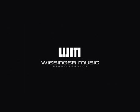
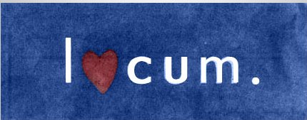
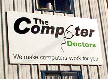
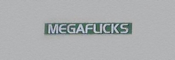
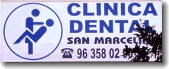
And now it’s time to look at the worst ones. We found some of the worst logos all over the internet and picked our top 10. Prepare yourselves and look carefully because you can learn a lot from these fails:
London 2012
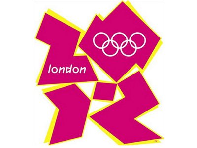
Arlington Pediatric Center

Mont-Sat
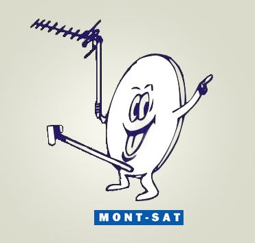
Locum
Kids Exchange

The Computer Doctors
Megaflicks
Clinica Dental
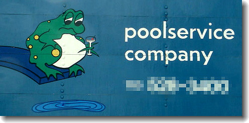
Poolservice Company
Trans’hit

Good logo redesigns
Now that you know what is logo, how to create it and you good some inspiration and advices on what looks good and what looks bad I decided to give you something else. A small collection of logos that got a redesign and changed from bad (or just average) logo to a good one.
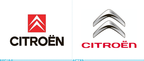
- Citroen
When you look at the old logo you have to admit that it looks pretty old. New logo is modern but still kept the most important part of the logo there.
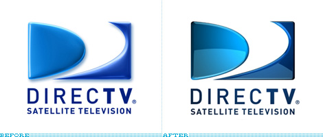
- DirectTV
This is another good example of modernizing the logo. Some new techniques were applied on the new logo and it looks good. 3D effect is lowered but it looks stronger.
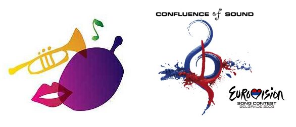
- Eurovision Serbia 2008
Do I really have to explain this one? The first logo looks like an 8 year old made it in about two minutes.
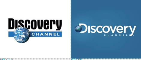
- Discovery Channel
Discovery Channel also decided to make a more modern version of their logo. They added some more elegant colors and a better font.
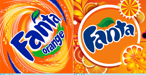
- Fanta
Last redesigned logo on our list presents exactly what we were talking about at the characteristics of the quality logo. Simple is better. Fanta just made a simpler version of its previous logo and it looked amazing.
Well, I hope you learned everything you need to know. Start with designing your logo, follow all the characteristics, search for some inspiration from good and bad logos and once you finish and it doesn’t look so good, try to redesign it and make it better. We also prepared some quality logo templates for download, check it out below. Good luck!
Infinite Love Logo
This logo is fully customizable, it can be easily adjusted to fit your needs.. The main idea is to show the way how the company stands out more than speak. Easy to edit, change size and color. Download here.
Spiral Eye Logo
Features: Fully Editable Logo, CMYK, AI, EPS, PSD, PNG files, Easy to Change Color and Text. Download here.
Alphabet A Logo
Features: Fully Editable Logo, EPS 10, EPS and AI CS6 files, CMYK, Easy to Change Color and Text. Font information at the Help file. Download here.
WaterColour
File Types: AI, EPS , PDF files – CMYK 100% vectors – Editable color – Editable Fonts. Download here.
B Letter Hexagon Logo
Features: Fully Editable Logo. EPS 10, EPS and AI CS6 files. CMYK. Easy to Change Color and Text. Font information at the Help file. Download here.
Alexand Logo
Features: Fully Editable Logo. EPS 10, EPS and AI CS6 files. CMYK. Easy to Change Color and Text. Font information at the Help file. Download here.
Flying Cloud Logo
Flying Cloud Logo Features: Super easy to modified. Easy editable text. CMYK @ 300 DPI – Print-ready. 100% scalable. CMYK Customizable AI. The logo is 100% vector, making it fully resizeable with no loss of quality and all text/type used is ready for you to edit with your own Name. Download here.
Love Camera – Photography Logo
This logo is awesome and perfect for any Photography lover or a photography studio. Download here.
Mountain
DESCRIPTION: – All Text, Color and logo is easy editable. 100% Vector (AI and EPS Format). VERTICAL & HORIZONTAL VERSIONS, BW Color & Alternative Color versions. CMYK color. Link to Download Font Include in readme file The Mock ups are not included. Download here.
Nature
Nature is a multipurpose logo, can be used in any companies related to outdoor activities, nature. Download here.
