When you visit some website the first thing you notice is how it looks. Is it too simple? Too complex? Or is it just plain beautiful? When it comes to creating good design it’s not just about creativity or imagination, you also must learn some other stuff called simply – design principles. What exactly are design principles? Well, you can figure that out by yourself. Those are simple rules you should follow when designing something. If you follow design principles then your work should be successful. Otherwise you will fail. So, what are the most important principles in design? We can divide them into 6 different parts:
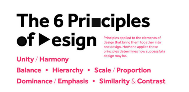
- Unity / Harmony
- Balance
- Hierarchy
- Scale / Proportion
- Dominance / Emphasis
- Similarity / Contrast
And in the rest of the article you will find short explanation of all 6 of these principles. Try to understand them all and your design will be perfect.
Unity / Harmony
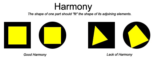
The first and maybe the most important principle is unity. The main goal of this principle is to make all elements of design support one another and to make them work together. What I mean is that you must make your elements look like they all come together and that every element is a part of some message. Unity can be divided into two categories: visual unity and conceptual unity. So, we can describe unity as a way to make all elements on some page connected to each other. In that way a visitor will see a whole picture and then will be able to view all parts of that picture. If you learn this principle well and use it on when creating your own design then your elements will communicate with each other and design will be more effective.
Balance
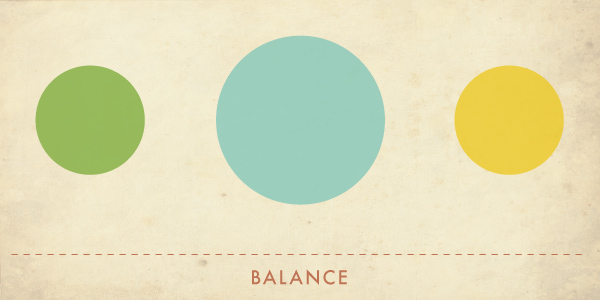
Balance is design is a lot similar to our balance, physical balance in real life. For example, if you put a bag of sand that weights 2kg on one side of some bar and 2kg on the other side then you succeeded with balancing the bar. But if you put 3kg on one side and 2kg on the other then everything will crash on that side where it is heavier. The same thing applies in design but instead of physical balance we have visual balance and visual weight. There are lots of elements that affect visual weight but most important ones are size (larger object = larger weight), color (some colors are heavier than the others), density (more elements in one space means larger weight), value (dark objects are heavier than light) and whitespace (this space is heavier than positive space). Now that you know all of that make sure to always balance elements on your site. If your elements are unbalanced then your message won’t be shown as one message and instead your visitors will see more messages and won’t be able to put them together. The best way to know if your elements are balanced enough, expect for learning more about visual weight, is to train your own eye and then learn to control visual weight and make visual balance only with the help of your eyes.
Hierarchy
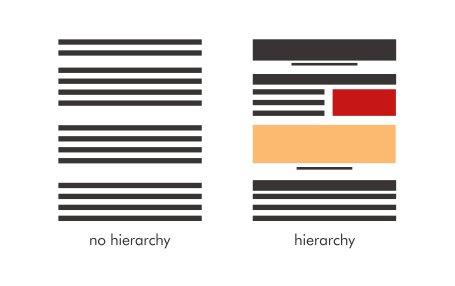
We all know that hierarchy is an organization of some elements or things based on how important they are. In design we have visual hierarchy which is pretty much the same. When you create some design you must visually organize your elements and decide how important each element is. In every design there are elements that are more important than others and it is important to emphasize that. And that is exactly why visual hierarchy is so important, because it brings more effective presentation and visitors of your design will understand its environment much better. It is very important to think about your content before you design a hierarchy and decide which part is the most important. You should also know that visual weight of elements can also be used to make a hierarchy between them.
Scale / Proportion
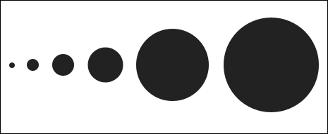
Now that you defined hierarchy of elements on your design the next step is to take care of scale and proportion. What exactly is scale? Well, we can define scale as the dimension of some object when related to some other object or element. Scale in design is very important if you want to demonstrate how big some element is when compared to human body. Everyone use it and if you learn to use it well your design will be much better. On the other hand, proportion is size of parts when looking at the whole picture. The main difference between scale and proportion is that scale is absolute and proportion is relative and when creating proportion it is important to understand every object in particular space. The good part is that you probably can’t be wrong when trying to create proportion because everyone could see stuff differently.
Dominance / Emphasis

Another important rule you should follow when creating focal points of your work is to create dominance through emphasis. When you create dominance on your design then you give some elements an advantage over other and those elements will probably be ones that visitors will see first. There are three different stages of dominance and that are: dominant elements (primary emphasized element that is most visible), sub-dominant (secondary emphasized element) and subordinate (elements with the least amount of visual weight and that will be in the background). Dominance is very important because, like I already mentioned, it helps in creating a focal point in design. Focal point can also be called as starting point and your most dominant element should be placed in that point. That can be your logo, tittle or something else that visitors should see right away. Dominance can be created with adding more or less visual weight to an element. To increase visual weight check its elements under paragraph “Balance” above. It can be pretty easy to create dominance but most of the people forget about that and then wonder why their design isn’t looking the best. The most important thing is to learn how some element will dominate space. Pay attention to some other designs that inspire you and you could probably notice the dominant, sub-dominant and subordinate elements on it.
Similarity / Contrast
The last but not the least important design principles are similarity and contrast. We can describe them as two tools that are used to attract visitor attention to some element or object. Similarity between elements show that they are similar and that they communicate with each other. On the other hand, element with contrast stand out amongst other and get more attention. Let’s start with similarity. Like I already said, similarity creates communication between elements. If you look at some design you will probably easily notice elements that are similar because they have similar size, similar color or shape. Be careful with this tool because if you put too much similarity then visitors could easily lose their attention and interest. Contrast is exactly the opposite of similarity. When you look at something you will probably notice elements that dominate the design. They can dominate because artist created domination we explained above but you can also notice elements because they don’t fit with other. That probably wasn’t an accident. Artist wanted to get your attention and make you communicate with that element because it is obviously important. Contrast can be accomplished with different fonts, colors, backgrounds, different sizes and similar tools, just like similarity.
And that’s it, those are 6 most important design principles that will surely help you to create stunning design and impress everyone who sees it. Try to learn even more about these powerful tools and then apply it to your design. Good luck!

