
Running a business website can often be a disappointing affair. The upsurge of visitors could quickly turn into a trickle and you might experience people leaving your website without converting to subscribers and customers. Even if you invest effort, time and money, the results can still be pretty mediocre, to say the least. When this happens, most website owners focus on fixing up the content, improving the marketing strategy and SEO and tend to neglect one crucial aspect and that is the web design. That said, here are the most common web design mistakes you should avoid when building a business website.
Having a slow website
Incorporating the latest technologies and elaborate JavaScript animations into your business website can end up looking amazing. The same can be said for using extremely high-quality images and custom font-types. However, these tend to slow down your website significantly, which results in high bounce rates and low-ranking positions in the search engine results page. This is something you should definitely avoid and instead, focus more on usability and website performance. It’s always better to have pages which load quickly and with less clutter than to have them load a number of different elements at once and have people leaving because they can wait for it to load.
Inconsistent layout
Less is always more when it comes to web design practices. The design should provide the visitors with focus, guidance, and more importantly, a good content hierarchy. Having a page cluttered with numerous design elements competing for a piece of user’s attention can only have a negative impact on the usability and overall user-experience. You should keep it simple during the design process and instead of adding elements, consider eliminating those that slow down the page or hinder the user experience. Stay consistent with your design, divide the content into manageable chunks and use white space to guide the attention of your visitors.
Poor navigation
Navigation is important for two reasons. First, good navigation is used to separate the various parts of the website available to the visitor and second, it should provide clear access to said parts of the website. On the other hand, if the visitor can’t find a specific section they’re looking for, they often come to a conclusion that there is no such section and simply leave the website. Not to mention the horrendous drop-down navigations menus which force visitors to make a number of unnecessary click in order to be taken where they want to be. Avoid using drop-down navigation menus and instead, opt-in for an easier-to-use, horizontal navigation.
Large chunks of interrupted text
Most visitors these days want to quickly scan the outlines of the content before deciding whether they’re going to read it or not. When your text is in one large chunk that has no clear indication which part is which, it makes it very hard to read. Not only are there no rest stops for the eyes, but it also makes the page look bad and gives the impression of lower quality. You should avoid this common mistake by using paragraphs, headings, and images to separate the text into easily digestible chunks.
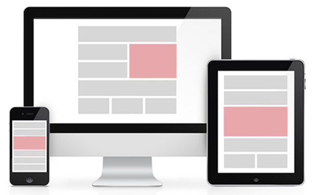
Lack of mobile-first or responsive design
More than half of all internet traffic today comes from mobile devices. Not catering to your mobile visitors is irresponsible and also an extremely bad business move. Not only do you lose a large portion of traffic from the people using mobile devices to browse the internet, but you also risk getting reprimanded by search engines like Google and have your website rank significantly lower or be completely omitted from the search results. Make sure your website is mobile-first or at least responsive and if you’re using WordPress, you can choose from a variety of responsive themes you can incorporate into affordable web design.
Poorly executed calls to action
The sole purpose of a business website is to convert visitors into subscribers or customers. This is where calls to action come into play, as they are used to invite visitors to either subscribe or purchase a specific product or a service you’re offering. If your call-to-action is unremarkable, hard to understand or simply hidden from plain sight, then it’s safe to say that your conversion rates will hit an all-time low. Try making the CTA visible, easily understandable and only ask for information which is relevant for your business.
A properly designed website is the key to a successful online business. It’s literally the first thing your visitors will see and as such, needs to convey a good first impression. Avoid using cluttered and unappealing design, as it will only disperse the visitor’s attention instead of focusing it and make the website load even slower. It doesn’t matter how good your website looks if it’s completely unusable. Keep the design simple and focus more on the usability than you would on appearances.
Author bio: Steven Clarke is business consultant/web entrepreneur. In his spare time, he likes to write about his ideas and share them with the world. Steven is a regular contributor to several websites.


