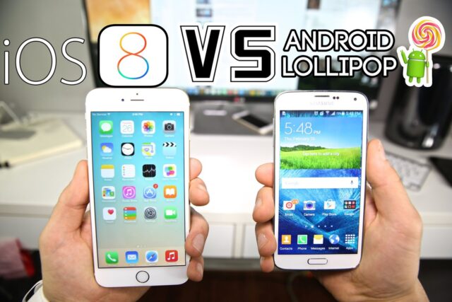
Google and Apple are regularly updating their mobile OS versions Android and iOS. Both companies include various unique features in their mobile platforms whenever they launch a new version. Because of several features sometimes users get confused and not able to decide a suitable mobile OS. They are not able to choose between both platforms as they both deliver excellent features with high performance. If you are asking yourself: ” What OS wins the battle? Android Lollipop vs iOS 8? Let the battle begin.
Android Lollipop vs iOS 8 Setting Up
Lolipop involves frequent step-by-step start-up wizards pointing out new features, along with pop-out balloons telling you where things are and how they work. It gets baffling very quickly, even for those who have minds that easily take-in such information, and makes for a stuttered introduction process because you’re frequently held-up going to where you want to be – the equivalent of walking down the high street and being accosted by survey takers and chuggers.
Apple offers gentle training with the Tips app, new to iOS 8 and which pops up weekly notifications, but other than a handful of very brief clues here and there, the whole raison d’etre of iOS is not to require instructions. To paraphrase Steve Jobs when he was talking of styluses on touchscreens: if your OS or apps require instructions then you’ve blown it.
Android Lollipop vs iOS 8: Look and feel
The look and feel of iOS 8, and introduced with iOS 7, is infamously Marmite. You love it, or you hate it. There is no between. Although dangerously close to being ideological in its push for flatness, few would argue that the look and feel introduced with iOS7 wasn’t bold – and boldness is what Apple does best.
Lollipop also isn’t ashamed to make bold use of colour, although in a more restrained way as part of its quirkily-named Material Design concept. Icon text has shadow in Lollipop – something banished from iOS on aesthetic grounds, but without it it’s impossible to view to app icon labels against most wallpapers.
Android Lollipop vs iOS 8: Launcher
When it comes to launching apps, or doing just about anything, everything is animated in Lollipop. Open the phone app from the lock screen, for example, and it expands out in a screen-consuming circular fill. Apps scroll-up from the bottom of the screen when activated. Even buttons and switches are animated.
This is always functional as well as fun, and there’s never animation for the sake of it – Google says that “motion must provide meaning”. Arguably this is true of iOS 8 too although some people find the rapid animations a little jarring and a little flashy. It feels as if Lollipop has the benefit of hindsight following such criticisms, and is much more restrained.
Android Lollipop vs iOS 8: Notifications and widgets
iOS 8 introduced widgets to Notification Center. These provide quick access to various app functions – everything from seeing the latest news headlines to quickly creating and viewing notes, provided you have the right apps installed. It works well so long as you frequently use Notification Center.
Lollipop continues Android’s ability to add widgets to the launcher alongside app icons if there’s space, or letting you add widgets to launcher pages of their own. Arguably, this is a superior approach and certainly more intuitive – the ability to wake your phone and then view vital information provided by a widget, before you tap a nearby app icon, is simply more efficient.
Android Lollipop vs iOS 8: Task switching
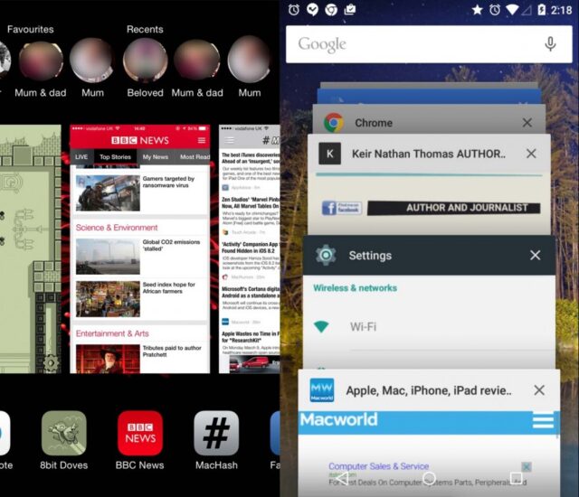
iOS’ multitasking system lets you switch between apps by double-clicking the Home button. This hasn’t evolved a great deal in recent times and the addition of Favorites and Recent contacts to the top of the screen in iOS8 has annoyed some. However, switching apps remains fiddly and more work than it could be.
In Lollipop’s Overview system, brought up by tapping the square hardware button on a device or the on-screen control, each browser tab from Google Chrome appears as a separate card, alongside apps. This is an example of what Google calls “document-centric” working. Theoretically other apps can take the same approach of splitting out individual files as individual cards too – word processing documents might have their own cards, for example, or movies you’re playing.
Our choice
When all is said and done, we are of course biased towards Android. Calling Lollipop the victor won’t mean much coming from us. iOS 8 is a worthy competitor to Android Lollipop, and Android 5.0 wouldn’t have been as impressive without it. Before you make your decision be sure to check infographic bellow about Android Lollipop vs iOS 8.
SOURCE


