Infographics and data visualization as well as editorial content
In the past few years, a new way is created for the visual presentation of data and abstract concepts: through infographics and data visualization.
The information age in which we live has changed the ways in which we communicate, think and exchange information and different forms of content and messages. The explosion of information is greater than ever. It goes in favor of publication Eric Schmidt, former president of Google that from the beginning of mankind until 2003 generated 5,000 petabytes of data. At the time of the publication of the era of social media, and user-generated content is not yet even begun. Add to that the use of smart devices and tablets we are exposed to the creation and exchange of data anywhere and anytime. This is emergent need for new ways of communicating that is quick, easy, effective and credible way to convey the message and the story we want to deliver audience, but on the other hand saturated information.
A new way of presenting data
So in recent years, there is a new way for the visual presentation of data and abstract concepts – infographics and data visualization. They appear everywhere – in newspaper articles, blog posts, websites, brochures and presentations and share on social media. They come in a variety of formats from static, through interactive, animated. Include graphs, charts, timelines and maps, or combine two or more of the above graphic representation of the hybrid graphics.
Do they represent new ways of story telling society that is oversaturated information so that they have issued the added value? We can say that infographics as a visual presentation which can contain text, data, or a combination thereof are used to tell a story, educate or offered a solution to an abstract problem. Additionally, the visualization of data representing the (technological) tools to visually organize large sets of data that the audience can use to research and analyze this data and thus has uncovered the story.
Infographics and visualization as well as editorial content in the mass media
Static infographics are today the most widely used formats for graphic presentation that is published as a supplement to the text in an image with vertical or horizontal orientation in press articles or other editorial publications were printed or online at the same time satisfying the requirements of a particular medium. Old magazines are these formats called charticles, and represented a technique that displays the full story in a visual format that combines graphics, image and text. His appearance and dimensions are adjusted medium to be published – the press or the Internet. Joanna Pearlstein successfully implemented this kind of content as an alternative to long texts on the position of editor of Wired magazine. Seafood Express is one example of this alternative form of long texts published in Wiredu.
USA Today, Fortune, The New York Times and The Wall Street Journal used information graphics for decades in their magazines, and published them today online in order to provide readers with the story added value. The New York Times with the largest graphics department, headed by Steve Duenesom as editor example is the media that invests in innovation to deliver good infographics, data visualizations or other multimedia stories to support reporting in its print and online editions.
Wider use Infographic and visualization of data
Infographics as editorial content can be found online and in specialty magazines that the majority part deals with topics of social interest.
Accepted today as a function of the editorial content of the private sectors where they are numerous startups, but by and large Fortune 500 companies use to inform end-users about the area that offer services or products with experimenting with today’s current technology. General Electric is one of the examples of large companies that are extensively used data visualization to provide greater context of the area in which it operates. All their visual stories can be found on a separate page Data Visualization. For example, their visualization Who’s talking about breast cancer as an example of a graphics tool that uses and displays a large collection of data (in this case the announcement from Twitter) in real time that are automatically generated by using technology. Interactivity is achieved through research and by adding annotations to the reader channeled through non-linear story.
With the guidelines at the end of the story, regardless of the medium, the audience or friendly technologies and their application in the public, private or non-profit sector, visual stories must show the true facts, accurate data, simplify and provide clarification. Ultimately the goal is to communicate the story in a clear, effective and accurate manner.
We have singled out some great Infographics just for you:
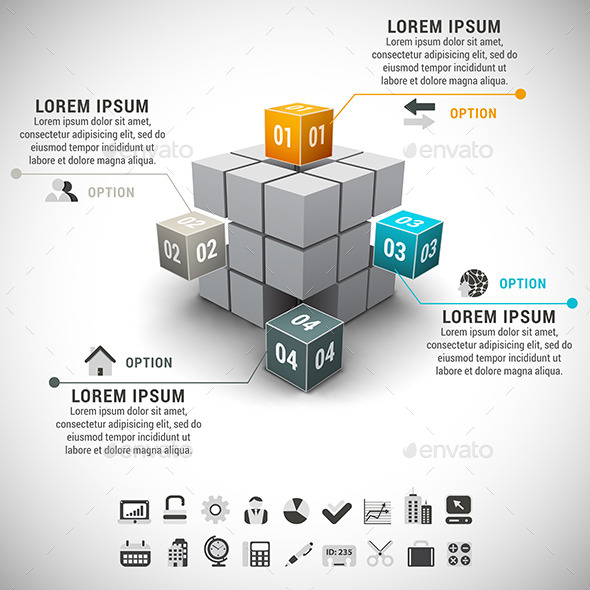
BUSINESS INFOGRAPHIC
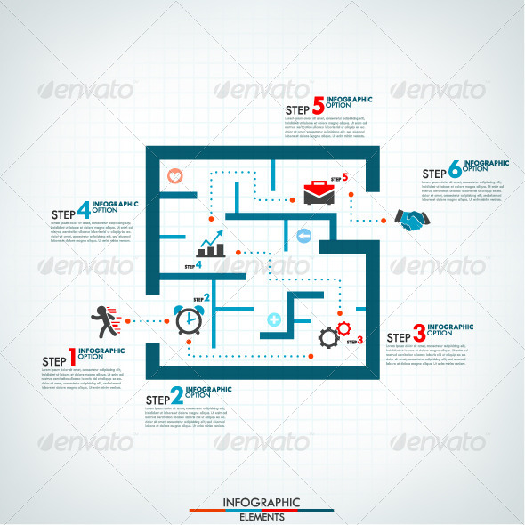
INFOGRAPHIC PROCESS TEMPLATE WITH LABYRINTH
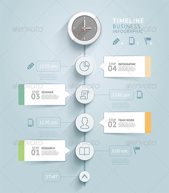
TIMELINE INFOGRAPHIC TEMPLATE
DATA ANALYTICS VECTOR INFOGRAPHICS WITH CLEAN TREN
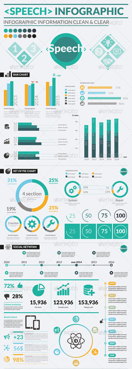
SPEECH INFOGRAPHIC
ALSO WE HAVE AWESOME PREMIUM PACK WITH 18 INFOGRAPHICS TEMPLATES

