Sooner or later, someone will come to your web site into a dead end – to seek access to a website that no longer exists. This terrible event will not be like in the movie The Matrix – disintegration of the system. In the IT world that relies on algorithms, simply can not be a condition for which there is no solution.
Because of this, when you click on the so-called. broken link (the one that leads to a page that no longer exists), or in the URL bar when typing the wrong address of the page, are only possible in two scenarios:
- You will notice that the website you want to access does not exist – they are called. 404 pages;
- You will be redirected to another page – usually the home page.
It is interesting that on the internet there is a kind of fear of these 404 pages – if you are familiar with the concept of the importance of a good ranking in Google, then you are probably aware that Google lowers the ranking sites that have such “dead addresses”. This of course is not a problem if it’s only a couple of pages on a website that has them in decades – but if for example you are doing a redesign of the web shop and you will have a different structure to address sales page of your products that Google has previously indexed and ranked (take the air now of reading), it is essential that you somehow solve the problem with the old address.
Redirects
One of the most common scenarios on the Internet when a user requests access to content that does is redirect to the home page of the Web site or category of articles dealing with the same topic. While this approach certainly fits in with the philosophy of “better any content, but no” if you have a web shop that’s just wrong to do. Wondering why?
The reason is the following scenario:
- potential buyer has not received information about a product that is specifically requested;
- occur emotions of confusion, anger, disappointment;
- occurs idea that web shop is not reliable and that behind him incapable of traders;
- buyer leaves web shop and never come back.
Now you know why you do not want to do redirect to the home page of the webshop. ideal is to redirect the customer to the identical product page which is located at the new address (if for some reason the product is not currently offered, redirect it to the category of the article to which it belongs).
No need to panic
404 pages are just part of the Internet – every day millions of people mistakenly typing in the address on the Internet or the content of a website becomes inaccessible. While in the case of web shops redirect to a page identical to the product is the best solution, without a doubt, and at news sites there is a possibility styling 404 pages.
The idea is just that the user receives one of the following:
- For information about the requested content is unavailable;
- The same content at a different address;
- Substitute content that will largely satisfy their appetites.
Stylized 404 pages
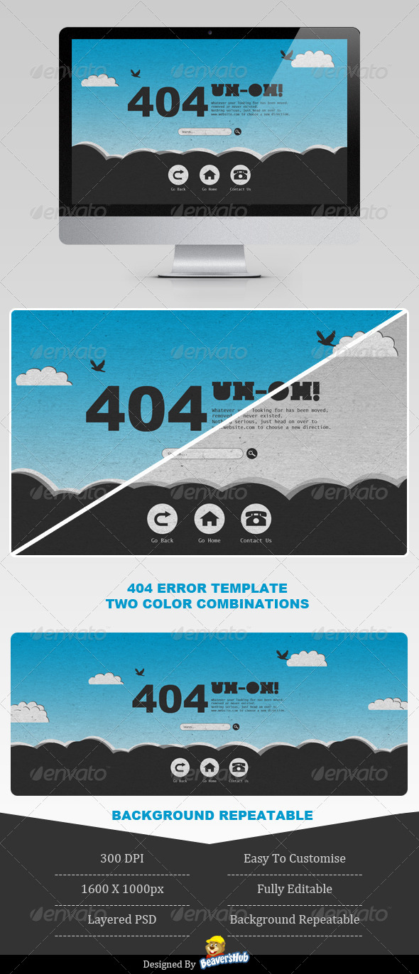
At the beginning of this article we said that the purpose of the 404 pages – to inform the client that the requested content’ve entered does not currently exist. While this information must always be transferred, it can be done in somehow, “richer way”.
As in our example, you can add a touch of humor or just to brighten up the “tragedy”. There are countless examples on the internet to stylize the informational message that is incorporated into the identity of the entire site. Have a peek at the links below, in terms of design 404 sites have really nice examples.
404 BLOCKS
NOT FOUND 404 PAGE
404 PACK FLAT STYLE
CARNIVOROUS PLANT 404 ERROR WEB PAGE
GAME OVER 404 PAGE
Milk Carton 404 Error Pages
MOLE 404 ERROR
CHALKBOARD ERROR 404 PAGE
CLEAN AND SIMPLE CHARACTER 404


