A landing page is a crucial tool for driving conversions on your website. Whether you’re generating leads, encouraging sign-ups, or promoting a product or service, a well-designed landing page can significantly impact your results. But what makes a landing page successful?
In this post, we’ll explore the key elements of a high-converting landing page, best practices for increasing conversions, and provide some examples of landing pages that excel at turning visitors into customers.
What are the Key Elements of a High-Converting Landing Page?

- Clear and Compelling Headline: The headline is the first thing visitors see, and it should immediately communicate the value of your offer. It should be clear, concise, and focus on solving a problem or fulfilling a need. Avoid being vague – use straightforward language that resonates with your target audience.
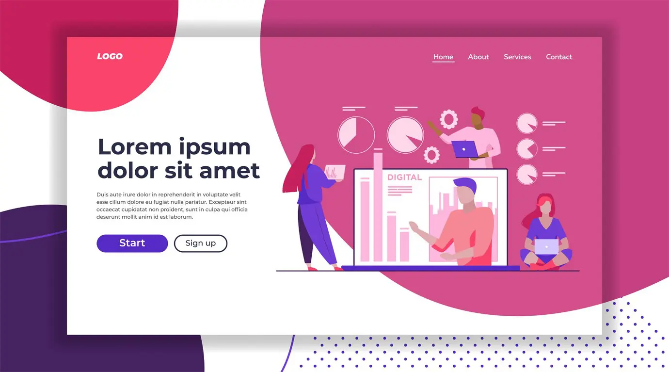
- Strong Visual Appeal: Design matters. A clean, visually appealing layout with eye-catching imagery can enhance user experience and keep visitors engaged. Use colours that align with your brand and visual hierarchy to guide users toward the call-to-action (CTA). High-quality images or videos that illustrate your product or service in action can further increase credibility.
- Concise and Persuasive Copy: The copy on your landing page should be concise yet persuasive. Focus on the benefits of your offer rather than its features, and write in a way that speaks to your audience’s desires and pain points. Break up text with bullet points, headings, and short paragraphs to make the content easily scannable.
- A Strong Call-to-Action (CTA): A CTA is arguably the most important element of any landing page. It should stand out on the page and clearly tell visitors what action to take. Whether it’s “Sign Up Now,” “Get Your Free Trial,” or “Contact Us Today,” the CTA should be action-oriented and easy to find.
- Trust Signals: Trust is a major factor in conversions. Incorporating trust signals like customer testimonials, case studies, security badges, or client logos can reassure visitors that they are making the right decision. Trust signals provide social proof and reduce hesitation, especially for new customers.
- Mobile Responsiveness: With mobile traffic on the rise, it’s essential that your landing page looks great and functions well on all devices. A responsive design ensures your page is user-friendly, whether visitors are on a smartphone, tablet, or desktop.
- Fast Load Times: Page speed is critical to user experience and conversion rates. Studies show that if a page takes more than a few seconds to load, visitors are likely to leave. Optimise images, use efficient code, and ensure your hosting provider can handle traffic spikes to keep your landing page fast and responsive.
What are the Best Practices for Increasing Conversions?

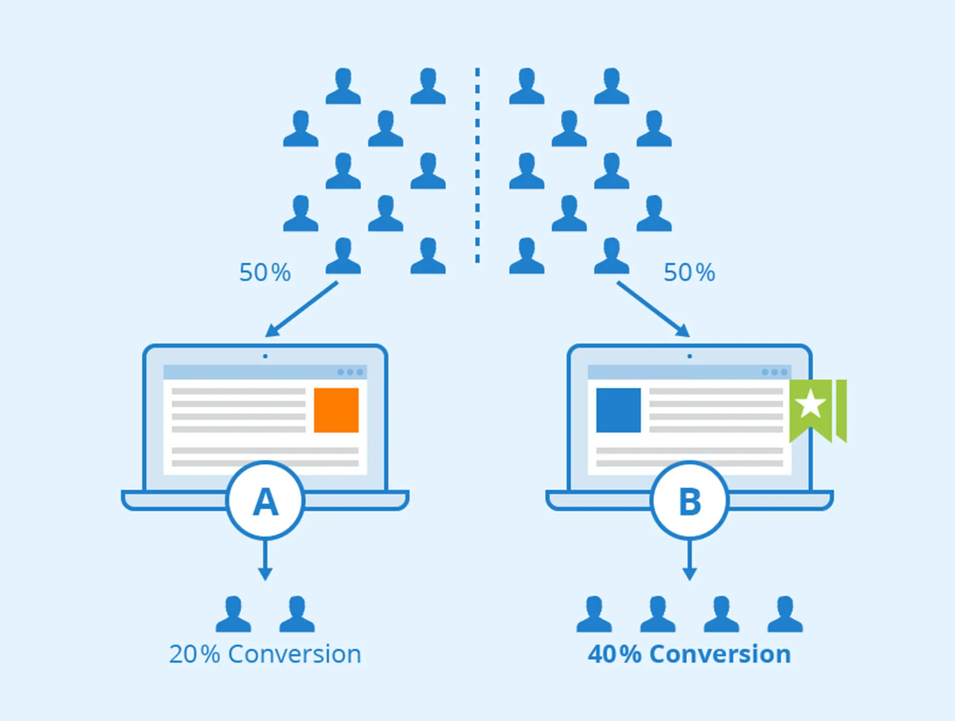
- Test Different Variations: Split testing (A/B testing) is one of the most effective ways to increase conversion rates. Create two versions of your landing page with small variations – such as a different headline, CTA placement, or button colour – and measure which one performs better. Constant testing allows you to refine your page over time.
- Use Compelling Offers: People are more likely to convert when they feel they’re getting something of value. Consider offering a free trial, an eBook, a discount, or some other incentive that appeals to your audience (and make sure your offer is clear and easy to redeem).
- Minimise Distractions: A landing page should have one clear goal, and everything on the page should guide visitors towards that goal. Minimise distractions by removing unnecessary links or navigation menus. The simpler the user journey, the more likely visitors are to complete the desired action.
- Include Social Proof: People are influenced by the actions of others – showcase testimonials, reviews, or case studies that highlight satisfied customers. If applicable, you can also add statistics to back up your claims, such as “Join over 10,000 happy customers” or “Our clients have seen a 30% increase in productivity.”
- Leverage Urgency: Creating a sense of urgency can push visitors to act quickly rather than leaving your page to “think about it.” Use phrases like “Limited Time Offer,” “Only X Spots Left,” or countdown timers to create urgency and prompt immediate action.
- Ensure Consistency Between Ads and Landing Pages: If you’re running ads to drive traffic to your landing page, make sure there is consistency between the ad copy and the landing page content. Visitors who click on an ad should see the same messaging, design, and tone on the landing page. This consistency helps maintain user trust and leads to higher conversion rates.
Here are Some Examples of Successful Landing Pages

- Dropbox Business: Dropbox Business offers a perfect example of a minimalist, high-converting landing page. The headline is clear – “Grow your business with Dropbox Business” – and the value proposition is highlighted with key features like “Easy team collaboration” and “Secure file sharing”. The page uses white space effectively, with a bold CTA button that stands out: “Try Free for 30 Days”.
- Shopify: Shopify’s landing page for its free trial is another great example. The page leads with the headline “Start your free trial” and a clear CTA that invites visitors to take action immediately. Below the CTA, Shopify lists the benefits of using their platform, supported by trust signals like reviews and testimonials from real users.
- Evernote: Evernote’s landing page keeps it simple and to the point. The headline “Your notes. Organized.” immediately tells the visitor what the product is about. The CTA – “Sign up for free” – is prominent and supported by features and benefits listed below. Evernote’s page demonstrates that you don’t need a complex design to get conversions – clarity and a focus on value work just as well.
As you can see, creating a high-converting landing page is all about understanding your audience and designing a page that speaks to their needs
By focusing on elements like a clear headline, strong visuals, persuasive copy and a compelling CTA, you can turn more visitors into customers. Don’t forget to test and refine your page to maximise conversions over time.
If you’re looking for professional help to create landing pages that drive conversions, consider working with a web marketing company for lawyers that specialises in digital marketing strategies tailored to legal professionals.
With the right expertise, you can optimise your landing pages to generate more leads and grow your business.
By following these best practices and learning from successful examples, you can create landing pages that not only capture attention but also convert visitors into loyal customers.


