You must have been in a situation where you needed to make a poster on a particular topic. It is important to know how to present information accurately and effectively. A poster is one way of communicating information, so it’s not bad to know some tips that will allow you to successfully complete this task.
What is a poster?
A poster is a way or method of communication of experts in various fields and an important element of a successful professional career of individual professionals. A poster is a common way of presenting professional papers at various professional gatherings. It is usually a large display that quickly and efficiently transmits information, most often research.
Making a poster is the job of a graphic designer, but not only that. His task is also to give you a suggestion of what it should look like. Of course, be prepared to pay for this service. Another option is to design and make it yourself in one of the programs such as Photoshop, Illustrator, and the like. When the poster looks exactly the way you want it, save the document and print it in the size you want.
Today, there are many sites and applications through which you can create interesting, eye-catching posters. Best of all, many of them are free and do not require any design skills. All you have to do is select a pattern and start inserting information. PosterMyWall will be the perfect decoration on the wall of your room, but it will also be a very attractive notice for the party you are organizing or the fast-food restaurant you have.
However, in order for a poster to serve the purpose, it is intended for, you need to pay attention to a few important things when making it.
Defining content
Make a rough sketch of what you imagined. Don’t worry about the details, just put the idea you have in your head on paper. This procedure is especially good when you need to decide whether to remove/add text, resize images, fonts, etc. An approximate sketch of the poster should be made at least a month before the deadline. The sketch should be given for review to a group of 5 to 6 people (friends, strangers, colleagues, etc.) to look at the poster while the author is not present. Have people leave their comments and suggestions on post-it notes. Special attention should be paid to the number of words, style, the flow of ideas, clarity of images, font size, spelling, etc.
Find focus
For a poster to be good, there must be a good idea for making it. It must carry a message that will reach everyone. In other words, before you start designing it, make sure you have a good idea so that you do not rely only on the aesthetics of your work, but also on the topic that will attract fans of the chosen topic.
Less is more
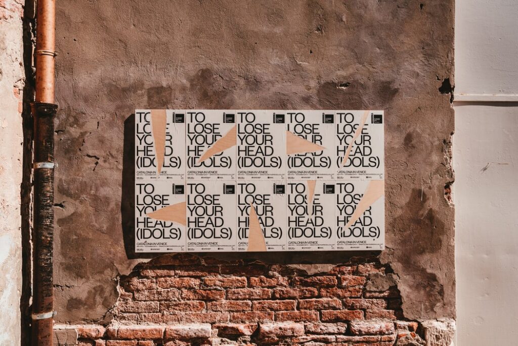
We are guided by this in the world of fashion, but also graphic design. Mixing different fonts, colors, shapes, images does not necessarily mean that your poster will look better and more attractive. Sometimes a pure white poster with a tree carries a stronger message about environmental protection than the one that supports it all with text.
Colors are important
The choice of colors is very important. For example, yellow causes eye strain, just like red. Of course, this does not mean that they are not appropriate in some situations. If you want a slightly intimidating poster, it is clear that black and red will dominate. Blue and white represent purity, so they are good for advertising water or something similar. Green has a relaxing effect, while orange indicates energy.
Colors should emphasize, separate, and define connect information. Also keep in mind that colors may look different on your monitor, in relation to what will be printed.
Necessary information
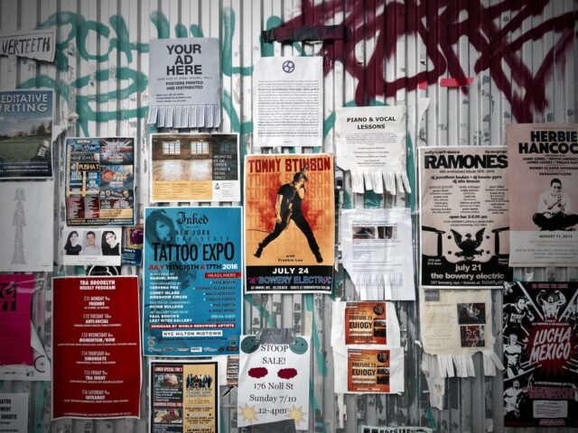
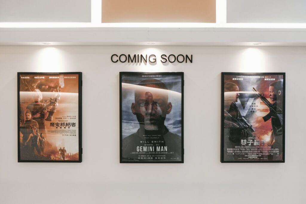
Depending on the purpose for which you are making the poster, its appearance will depend, as well as the information it contains. For example, if you are making a poster for a movie in an announcement, it will have to contain information such as the name of the movie, the main actors, calculated with an image related to the plot of the movie itself. If you are organizing a concert, it is logical that the poster will have to, in addition to the name (not necessarily pictures of the band), contain other necessary information such as place and time, ticket price, and so on.
Avoid common mistakes
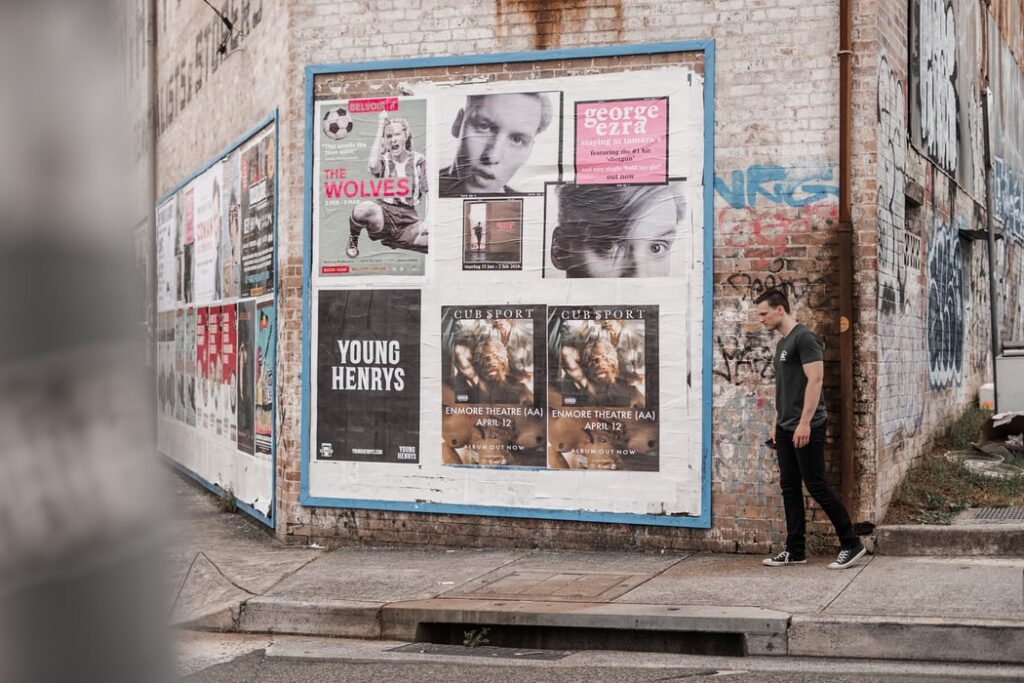
An overpowered poster is a big mistake. Let’s be realistic, do you really think anyone will read thousands of words in passing? Posters with too many words can lead the viewer to just look at the pictures or more likely avoid the poster altogether. Do not use hard-to-read fonts and serif fonts. If you do use them though, stick to one. If there are photos, add a gray or black frame around them to make them stand out visually. Watch out not to put too thick a frame around the photo or a frame of inappropriate color concerning the photo.
Final thoughts
The poster should contain all the most important information about your work, which will, as a separate unit, and at the same time as an aid to your presentation, present what makes your research in a clear, concise, and interesting way. This also means that you should not approach the structure of your poster in the same way as you approach the text of a paper for a collection or journal. The purpose is different.
The title should not be too long, but short, but to attract attention. All you have to do now is sit down at your computer and start playing. Follow the tips above, but also try it yourself, research, change the look of the poster, colors, and fonts until you get the final result that you will be satisfied with.
